|
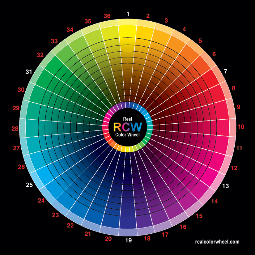
This Real Color Wheel is for everyone to print out and use, including the printing industry, I'll keep the hardcopy selling rights, thank you.
There are no pigment reference dots on this one. Download it directly. Notice that the image you down load may be a png file, your printer may need it converted to a tiff file. Also, for the internet in had to be a 72 dpi file, change that to 300 dpi for a 5" printout. Other wise it will be 11.5x11.5 inch printout. The image was made in CMYK and converted to an sRGB, png. Download it, convert it back to a CMYK tiff for the printer and print. I use the Euroscale profile for this image. I like the profile in the image for printing with no profile in the printer. Send me an email if you don't have it, I'll send the profile to you. I wish you could see the cyan RCW#25 from my plotter with my transparent cyan, it looks the same as a Kinko-FedX print.
|
|
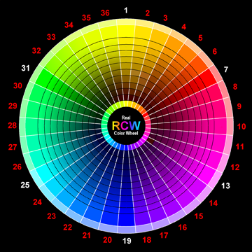
The original Real Color Wheel painting 12-24-95, #816 was painted by me for artists like me painting on location. I found the colors in nature while painting. Nature uses perfect complements in it's every moment. All colors have complementary opposition colors, primary oppositions are the most striking. The first color break down is in my sketch book dated 12-1-88. The main full chroma colors are the same as the computers RGB colorwheel, I was very glad to see that around 1993-4 but it will not work for the pigment artist, it gets dark by subtracting light and has nothing to do with mixing in opposite color pigments.
Use this RCW like a visual aid typewriter key board for color.
It records correct pigment oppositions for making dark colors with transparent paint or ink. It matches all colors in nature and how they shadow. Use it for Artistic painting, Photography, Stage Lighting, Textile Dyeing and color coordinating. The RCW color wheel works, This is how it works with ink artists, 4 color printers and plotters. A plotter is a larger printer that sprays color as opposed to a printer that picks pigment up from another inking plate or heats it onto a surface. A plotter is used in printing canvas or paper giclees and is color accurate. I have a Roland HiFi Jet FJ 52" Plotter. Here's what I did to this image. 
My painting was painted without black pigment. There is this short-fall in CMYK, it starts adding black into the value too early and loses color in the deep darks. Today, 4-5-9, new plotters add two more blacks, gloss and a more transparent black to help with this problem. I made a transparent yellow ink to use in the plotter. Today all pigment printers use a cool opaque yellow which I think adds to the lightness of a three primary mix of colors which in turn uses more black to compensate. The color 1870 Indian yellow which in it's mass color in a bottle is closer to burnt umber than yellow can be reduced to any yellow color from cadmium yellow light, pale, medium or dark. It is a warm yellow as opposed to the plotters cool yellow which will not make a perfect warm yellow. Today, Spectra Colors Corp. makes a synthetic Tartrazine Azo pigment that matches the original Indian yellow golden color that a yellow transparent pigmented ink can be made from. The balance of pigment, water and ethylene glycol is critical. I increased Selective Black in the CMYK Proof Setup's Working Black Plate, and reduced the intensity of the black ink in the plotter with an ink adjustment. Then used the acrylic pigment's transparent opposition colors in thin washes to give the now lighter blacks some color instead of just black. It's amazing how similar it looks to my painting now. Well, that's one way to do it but it's not a high production method. It seems black ink in print takes over making a pigment that was "painted darker with it's intensity hue only", let's say.. 3 coats of transparent magenta instead of one. So instead of having 300% magenta ink making a darker magenta in the print, you have 100% magenta ink plus black to make it darker. One could lighten the black ink level and paint in the "darkened by intensity only" magenta colors with a brush, again it's not a high production method. COLOR THEORY Printers and plotters use the Computer's RGB color wheel and convert it to the printer's CYMK color wheel. They look almost the same, but not exactly. It's better to change the RGB to CMYK and adjust the CYMK. It's best to convert a RAW image directly into CMYK. Printing any converted RGB profile has some printing problems. Intensely layered magenta isn't possible because the full depth of the pigments ink won't print with only one coat without effecting the rest of the print, even with the extra Light Magenta ink. CMYK adds black ink at this point. RGB prints what looks on the computer like a perfectly balanced color wheel, and shifts the cyan and magenta 30 degrees in the print. This expands the Green to Cyan range and shortens the Magenta to Red range. WHAT YOU SAW IS NOT WHAT YOU GOT.. on your printer. Also the printer will not print the higher RGB gamma ranges of color. The CMYK Real Color Wheel you see on your computer is what you will get on your printer or plotter. It looks much duller in comparison to higher gamma RGB realcolorwheel, but the CMYK is the gamma range that is possible with ink and it is what the printed image will look like. The RGB color system has a much higher color gamut, much of high end color is lost in CMYK. Give the unprofiled plotter a CMYK profiled image as opposed to giving the printer/plotter an RGB profiled image of higher gamma and letting the printer/plotter convert it. It won't correct the color shift of magenta and cyan, to do that it takes an original CMYK image. The newer plotters give more to play with, with as far as matching colors to a painting or photo. Longer ranges of colors can come into play. For instance, Cyan and Yellow pigment or ink must cover from cyan to yellow in both CYMK and RGB. That's 130 degrees plus the extra 30 degrees because of the RGB color shift. The colors between Green and Yellow are limited by at least 15 degrees. Some plotters give the option of adding two colors to CYMK. An extra pre-made green ink to mix with yellow, that evens out the colors available to be reproduced in the green to yellow range plus orange ink. It's not perfect, but it can help with some images. I didn't like it. The most useful combination of color in nature painting is green and a yellow/orange/red ink mixtures. Add green and magenta together to make a neutral black from pigment or dye color, That's the shadow color of green and magenta.
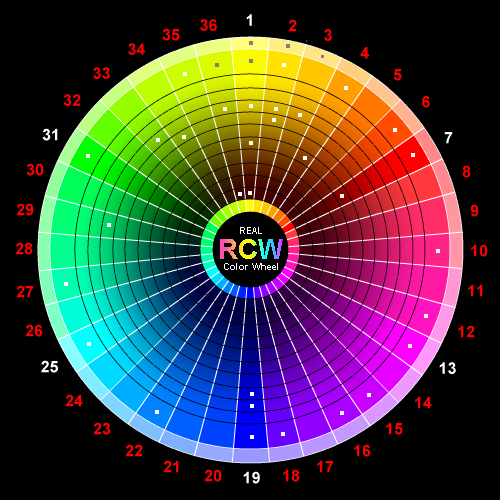
My best reproductions are made with a CYMK image that has been worked on. An RGB image can be converted to CMYK closely in some respects by giving it first a sRGB profile then a ColorMatchRGB.icc profile before changing it into CMYK. This will not correct the color shift of magenta and cyan though, that can't be corrected. ColorMatchRGB works as the profile if used in the plotter only also. As a CMYK image either the plotter or the image needs a profile to print with. One of them should have no profile, I can't say that often enough. After this point it can be re-converted to RGB again if you wanted a gamma limited RGB for the computer and email. The "color shifted" RGB should now contain the "color shifted" CMYK colors with an sRGB profile. Here, in the image below are the CYMK RCW colors converted into RGB colors for your monitor. A browser won't view in CMYK. The colors look the same though, The original image was made in CMYK. A conversion change in this direction doesn't effect the CMYK colors and removes the color shift RGB has.
The four large color dots are only extra added RGB colors for this example. They are unconverted RGB colors added to a CMYK image that has been converted to an RGB image and worked on. In these conversions the RGB keeps the same colors that were in the CMYK. Now I can add RGB colors to the existing CMYK colors if I want but they won't print. Yellow to red RGB colors are accurate but not the rest. They won't print accurately.. but I can add them for monitor viewing. This shows the printers problem. Those 4 corner color dots below can't be reproduced in print accurately, they are out of gamut. Only the spectrum in the inner CMYK RCW will print accurately. The four outer colors won't because they are RGB colors that are out of gamut, all CMYK colors are in gamut.
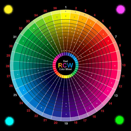
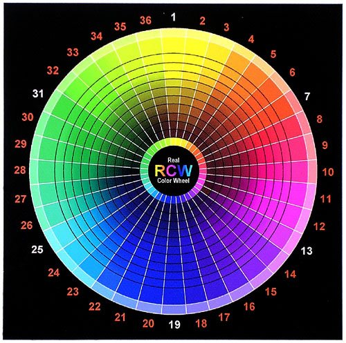
Below is an RGB RCW color wheel, made on the computer by numbered ratios to match crystals as they get darker, these colors match the element's colors that the artist uses as pigment. Notice the RGB image is brighter and a higher gamut. 36 REAL COLOR WHEEL
Ink History
|
| 00 | 19 | 18 | 17 | 16 | 15 | 14 | 13 | 12 | 11 | 10 | 09 | 08 | 07 | 06 | 05 | 04 | 03 | 02 | 01 | 02 | 03 | 04 | 05 | 06 | 07 | 08 | 09 | 10 | 11 | 12 | 13 | 14 | 15 | 16 | 17 | 18 | 19 |
| 01 | |||||||||||||||||||||||||||||||||||||
| 02 | |||||||||||||||||||||||||||||||||||||
| 03 | |||||||||||||||||||||||||||||||||||||
| 04 | |||||||||||||||||||||||||||||||||||||
| 05 | |||||||||||||||||||||||||||||||||||||
| 06 | |||||||||||||||||||||||||||||||||||||
| 07 | |||||||||||||||||||||||||||||||||||||
| 08 | |||||||||||||||||||||||||||||||||||||
| 09 | |||||||||||||||||||||||||||||||||||||
| 10 |
|
I have been working with a chemical company called Spectra Colors Corp. in my home State, N.J., 4-2-6, to provide my transparent yellow color. Spectracid Tartrazine 170 / Acid Yellow 23 / Azo / C.A.S#: 1934.21.0 / H:1 F:0 R:0 P:D / APR 25,2006 / Lot # T14976 / Scc Order # : 63305, is my choice. This is it, a transparent Indian Yellow for plotters and artists. It is very permanent, never changing at all after 6 months in the hot Lahaina Sun, the ball point writing was gone. 1 part Ethylene Glycol and 1 part water added to the 2 parts pigment made it waterproof ink when dry. As a water color add gum arabic and a little honey. To make an acrylic transparent yellow equal to PY:153 dioxine nickel complex or PY108 Anthrapyrmidine, add some acrylic gel. The amount of water added to the pigment to print a cadmium yellow light is water-ethylene glycol 9:1 pigment. In this image there are 3 cups of 1:9 mixtures, (they all look similar) this is the pigment and dilution I'm printing with. The two rows are graduated hues. Printing with full strength (1:1 with water) the ink printed a cadmium yellow medium hue color. 1:9 is what the plotter needs to bring it down to cad yellow light hue. I found all colors with yellow included in them are rich and more beautiful. 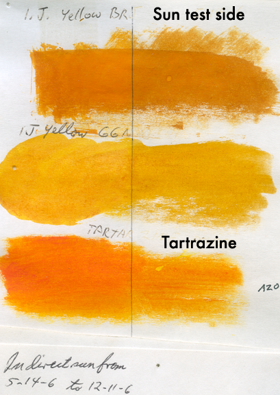 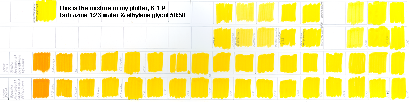 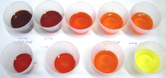
1/15/11, It's taken five years but I now have independent CONFORMATION for my transparent yellow plotter ink, it has now been reported in an article by the Helsinki University of Technology.
Given here is a few of the inkjet dyes that are available in the powder form along with its characteristics. CI Name CI Number Concentration Quality Characteristics
THE NEXT GREAT STEP WILL BE FOR INKJET INK MANUFACTURES TO START DISTRIBUTING TRANSPARENT YELLOW INK. Saying red (which is made of yellow and magenta), is a the primary color and giving magenta a code like PR:122. That's (P) for pigment and [R] for red #122 in the Color Index.
Yes, the Yellow, Cyan, Magenta color wheel is accurate, not the red, yellow, blue colour wheel is not. Compare them. My color wheel adds to that, it matches the way elements in nature get darker. This gives the ability to mix all opposite colors into a neutral black and correctly moves yellow to brown not greenish-black and cyan to blue with no greenish-black in it. This is a big problem today, because all of our State Schools are commanded by the States School Standards to teaching the Red, Yellow and Blue as primary colors. Very sad. The cyan ink used also has a problem, it's not a pure cyan but rather a cyan hue that has a magenta side. I have ordered some manganese dry pigment from Old holland to make a truer hue and will test it as an ink when it arrives. This will probably solve the printer problem of making a good cyan printout.
9-27-8, I'm working on the cyan again because I'm just not satisfied with the ink in my plotter, it doesn't matter which brand I use, none of them are good enough for me. I wrote to my old friends at Spectra Colors.
The pigment arrived and I tested them on paper, canvas and glass. This is the first time I found true PB:15 ink for my plotter. I was so tired of compensating for the magenta side inks I had been buying. I just couldn't get a good cyan colored sky or water. This may be the answer, it looks great on paper but it will be awhile before I get it in my plotter to make a print run of my color wheel. 11-20-8, Pigment= Spectra Cyan is SPECTRAMINE BLUE FBLK LIQ Direct Blue 199, 1:6 water/ethylene glycol. Now I have a good complete transparent ink palette. I like a cool black ink opposed to a warm one. I'll work on that next.
Today is 11/23/08. It is now 12:11 PM
The day before yesterday I ran out of G-7 cyan in my plotter. I have two bottles on hand so it was no problem. Instead of just refilling my homemade bulk ink system I decided now was the time to work on my Spectra cyan. Spectra had sent me cyan in two forms, dry pigment and liquid.
As far as the different ink colors for different plotters is concerned, this is what I found. MediaStreet G-6 cyan for the 4 and 6 color plotters reaches the same value (not color) by diluting the Specta "cyan" like this, 1 Spectra : 2 water : 1/4 ethylene glycol. I use the addition of ethylene glycol as a slower drying lubricant for my plotter's heads. This final color is still too dark in my opinion. The cyan it prints on my color wheel looks too blue. Remember, cyan changes to blue as it gets darker. For my plotter I settled on 2:5:1/2, two spectra liquid, five water and 1/2 ethylene glycol. I'll adjust the final color with the addition of ethylene glycol. As for the other ink colors, comparing all color values,
Conclusions;
Here is a 256 color Real Color Wheel Swatch Palette © in CMYK for you to down load, convert it from RGB to CMYK and use for your printing purposes. It will convert properly because it was made in CMYK. You can use it but not sell it or a print of it. The small squares are opposite complement colors. Ask for the free .aco file to install it in your graphics program. 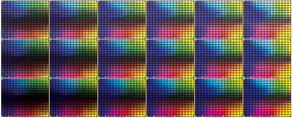
The color is cyan but they, like every other manufacture in the color industry, still use colors based on red, yellow and blue primaries (the old Church/Ostwalt system.) The ASTM needs a major upgrade, but it's not going to happen without public insistence. My Real Color Wheel works, it has a placement for each brown in existence as well as every other color.
I did tests on; Ink Jet Art OEM Compatible Plug-N-Play Cannon (Media Street label). inkfullstrength1:1water, 1:10, 1:15, 1:20, 1:25, 1:30
The small square is the color taken from the under-tone of cerulean. The smaller square is the larger square lightened. The color I want opaque and transparent should make this transition.
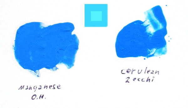
Below: In this image the top two are pigment inks I print with on my plotter. The bottom left is Liquitex Thalo blue, the bottom right is has chlorinated phthalocyanine. It is the color I hoped I could get with manganese transparent. 3-1-8
1-22-7
Transparent yellow and transparent cyan make the transparent green hue that will mix with transparent magenta and make a darker neutral so less black will be used. The normal RCW yellow to blue opposition adds magenta to yellow before adding cyan. Its all complementary oppositions to reach black. Include transparent Azo yellow as the replacement for the opaque yellow we are using as ink today. Yellow and magenta are the split complements that mix with cyan to make a neutral dark. Someone has to do it, I like my tests so far.

The lower two files are 1) RGB and 2) CMYK converted to RGB. They are graduated red to cyan. The same way pigments mix to black instead of light's color wheel where red and cyan mix to white.   bluer cyan printout than CMYK. Both have same red to dark gradation.

There is a big difference between the blues, cyans and magentas. There is a smaller difference between the reds and purples. CMYK prints the better, it gives a more accurate color image. 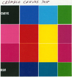
PhotoShop Assign Profile = Gives the new profiles colors and the new profile's name. (Euro has the least intense & most intense colors) PhotoShop Convert to Profile = Keeps the same profile name and changes the colors. UnCoated = more intense color Coated = less intense color USweb uncoated = slightly more intense color than coated USweb coated = slightly less intense color than uncoated Euro uncoated = less intense then USweb uncoated Euro coated = The most intense, more intense than uncoated USweb or Euro uncoated From least intense to most intense. = EuroUncoat - USwebCoat - USwebUncoat - EuroCoated In the end I think U.S. Web Coated (SWOP) v2.icm is best. I can take an image that looks great on my computer and printed at KinkoFedX, subtract 50% of all my inks except -60% of K and it prints on my plotter great. That's how I print my colorwheels on matte paper. (NOTE .icc & .icm profiles are swappable, just change the syntax extension) 6/1/09. It is now 10:43 PM - Made an ink test with 2 passes over the same print, blue down first, transparent yellow PY100 (I made my own ink) over blue, second-pass made the darkest neutral second color. (1) Yellow over blue, (2) yellow-gr over purple, (3) green over magenta, orange over cobalt, cyan over red was too red because I can't print the cyan tube mass-tone color with the cyan ink, it would take a third printing pass.
Order this complete color course on CD, $35.00. Order only a 5"x5" Laminated Real Color Wheel $10.00. Free Shipping |