|
|
|
|
|
|
|
|
|
|
|
|
||||
|
|
|
|||||
|
|
|
|||||
|
|
|
|||||
|
|
|
|||||
|
|
|
|
|
|
|
|
|
|
|
|
|
|
|
|
|
|
|
|
||||
|
|
|
|||||
|
|
|
|||||
|
|
|
|||||
|
|
|
|||||
|
|
|
|
|
|
|
|
|
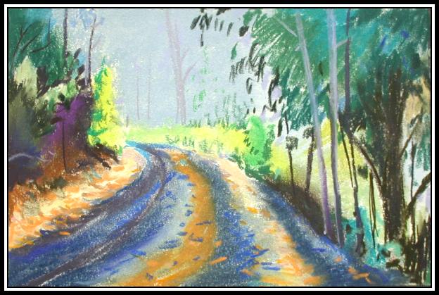
NuePastel water-based on black paper, 1980. |
a very nice support paper to work on. |
|
|
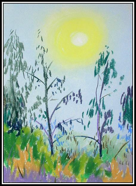
Poli Poli Hot Sun, from my sketch log books.
|
|
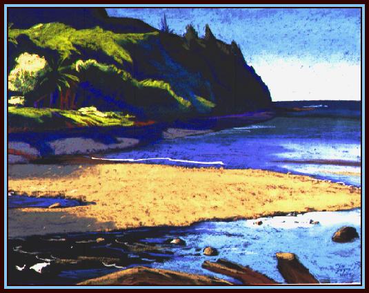
Maliko Bay on black paper. |
|
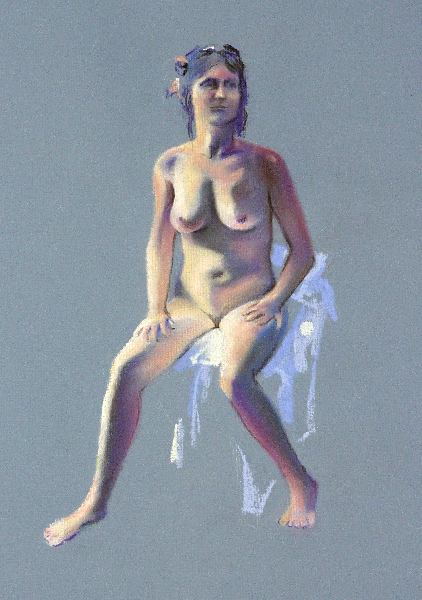
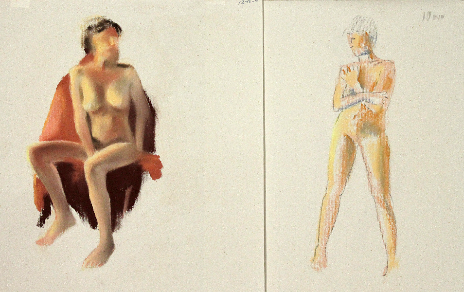
My third 2 hour sitting. Same week, different studio. |
|
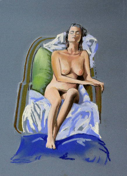
I bought a new hemp paper drawing pad and it holds the texture is much stronger than the colored paper so it took longer to fill it. I didn't get the picture finished but it does show an intermittent stage close to finished. We did 10 minutes of 1 minute, two 5 minutes, two 10 minutes, one 30 minute and one hour one, sometimes 2 hours. human proportions Link to more life painting in pastels. |
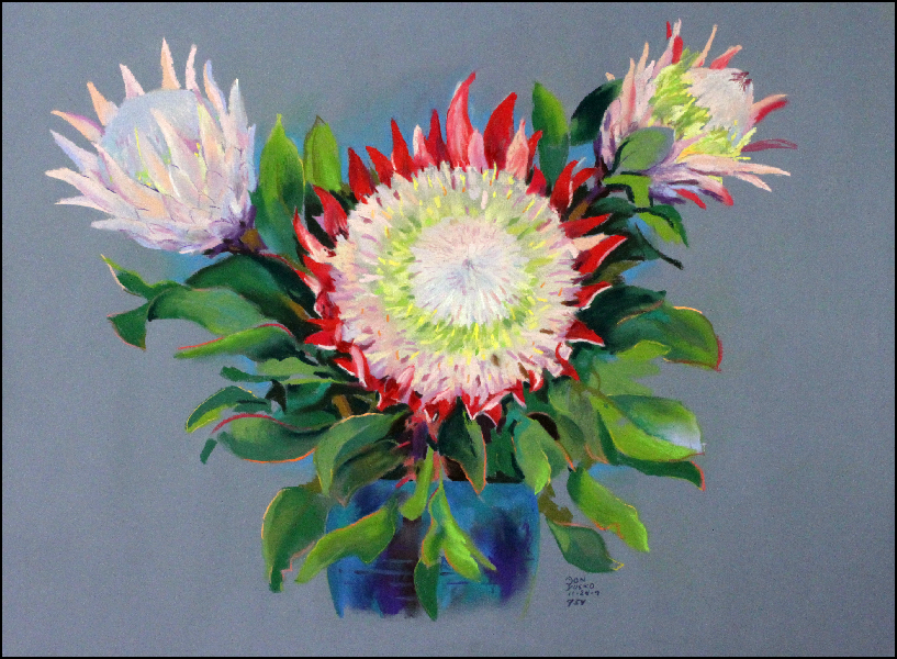
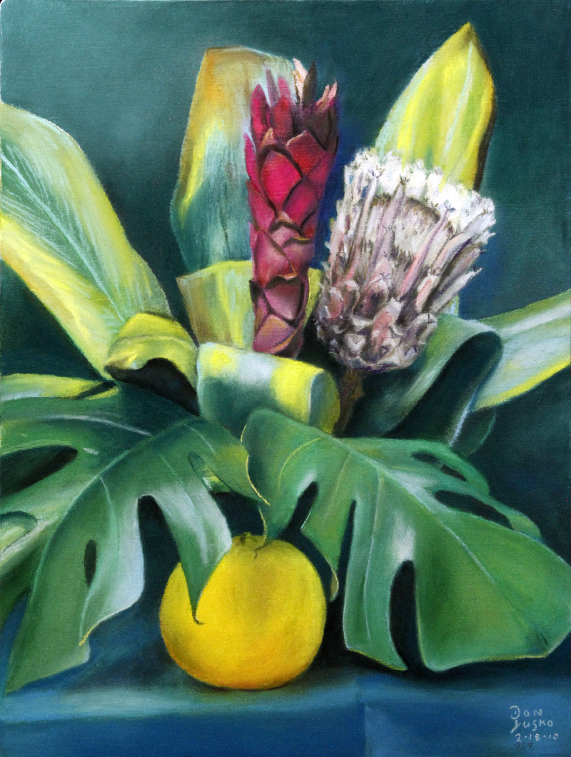
The protia flower came from Africa and it's doing very well at the 3000' level here on Maui. This is the King Protia and two Queens, it's about 8" across. |
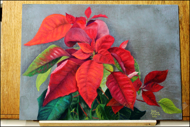
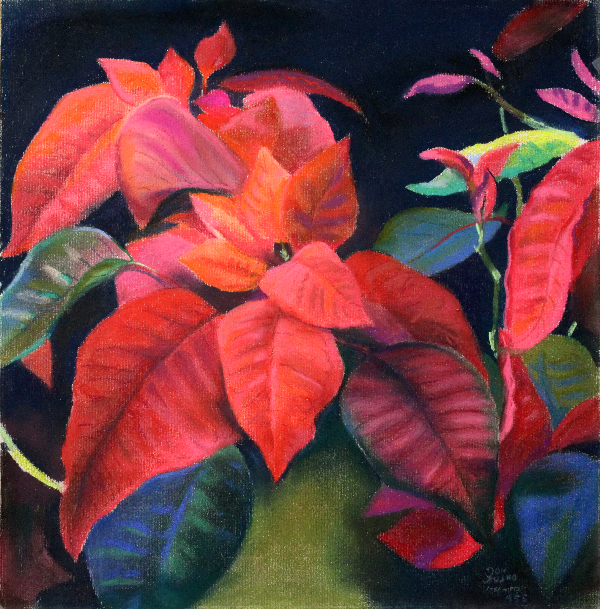
Poinsettia 2010, Pastel on Paper 12x12, 1-11-10 #995This is a 12x12 pastel on the hemp paper again, like the life drawings. I decided to do a finished still life where I had no time restraints. The poinsettia started dying right away, the pastel took 4 days while I was also working also on the computer. The paper texture was so tough it tore a paper stump to shreds. My finger blending worked but it was like sandpaper on them. This paper's printed cover said Charcoal Paper, I'll leave it for charcoal sketches. TIP: draw with one eye, Don't move your head. 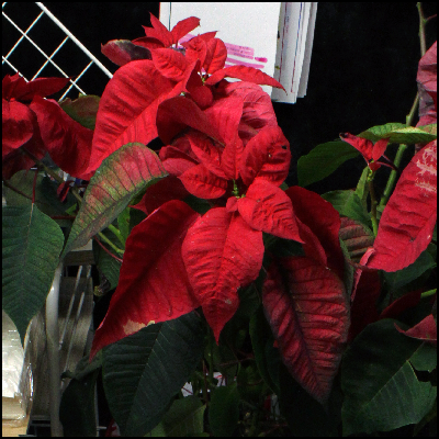 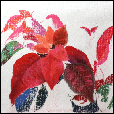
|
|
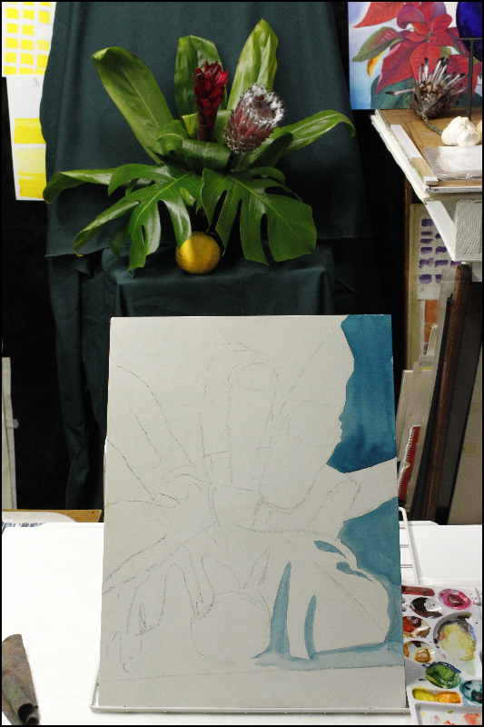
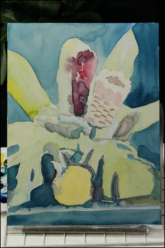
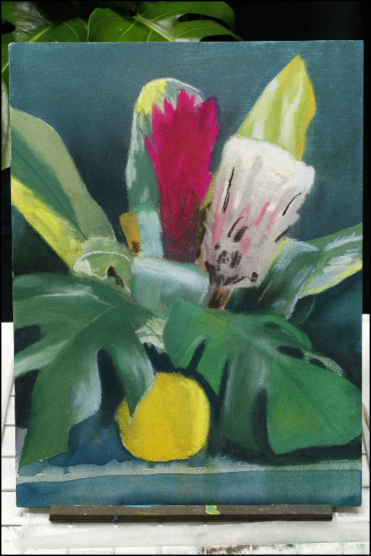
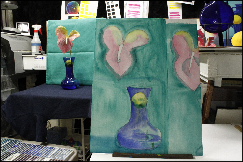
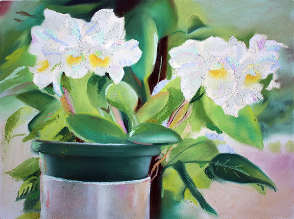
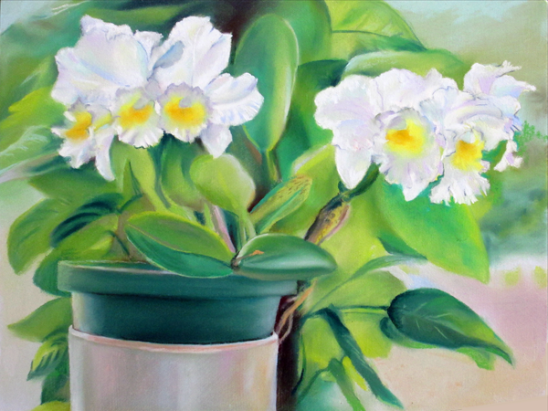
Pink Anthurium Doubled, 14x18, Pastel on board, 2-3-10, #958Today is 2/2/10. Started another pastel, Pink Anthurium Doubled, on 1/8 hot pressed masonite with a pastel acrylic paste ground. First I used charcoal to draw the image. This time I painted the base image in with water color to save me time. It only took 1/2 hour for the water color and now I don't have to spend as much time filling in the solid color. Yea.. much faster! I had it 100% covered with pastel today. 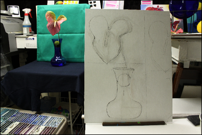
This pink anthurium is held in place by a lemon. The second pink, same as the first, is my painting in my painting. |
|
| Second day Today is 2/3/10. It is now 9:42 PM Nothing can pass this media for the pure color of it. You have to know the correct oppositions and how those colors get dark and have your palette set up that way, like mine. There is no need for the pigment black in pastels.
We need the full pastel pigment color of PR122 and PV19 and one of Pr122 + BV10 to match the Shinhan Water Color from Korea.
We got it! 2010, in a brand by Art Alternatives. More below. Tip: A stiff small flat hog bristle brush will take you back to the original textured board ready for another color. You can take out a soft pastel with a harder paste so don't work in reverse. With this new "paint on pastel texture medium" you have as much freedom changing color as a fresco painter. |
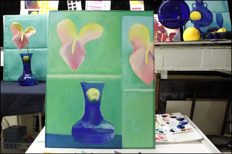
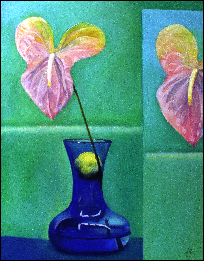
The pastel painting is finished. 2-3-10
Tip: In a day the painted pastels harden on the top allowing a lighter touch applying color the next day.
This crust can easily be broken to continue a powdery blend.
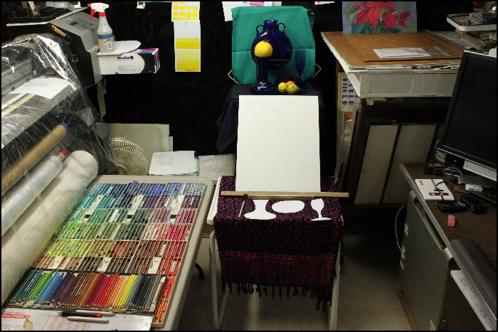
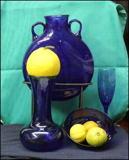
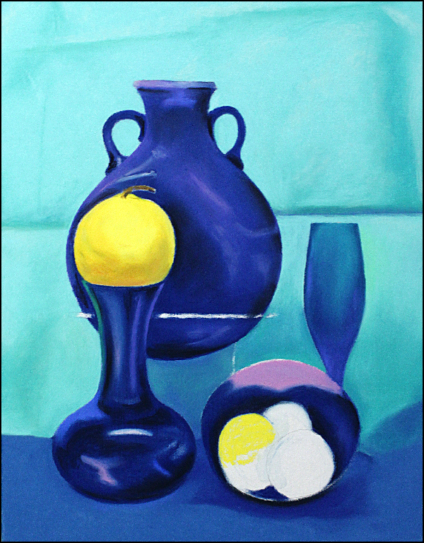
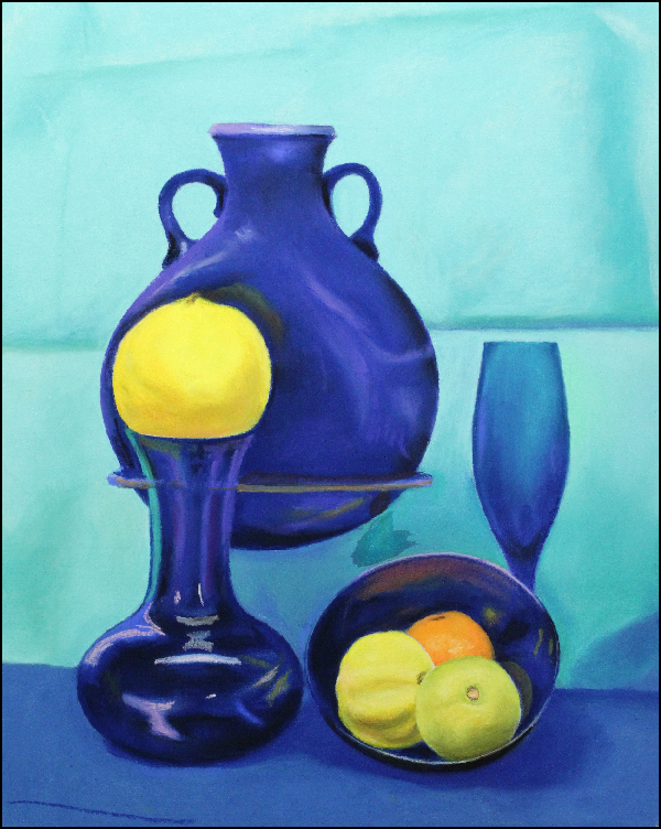
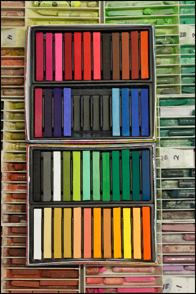
1-17-10, 14x18, Blue Glass and a Lemon, #957, board, pastel14x18 pastel on coated board, Blue Glass and Lemons. Started drawing on 1-18-10. I like still life's because there is no hurry. Heres a picture of my 350 pastel color palette laid out and moveable and the pastel painting setup.
|
| The drawing was made with a light gray pastel pencil directly on the board, I should have done it on paper with a pastel or charcoal layer on the back and transfered it. I've done so much erasing on the front I may need to coat the areas again.
1-18-10, Two days into the drawing I decided to use a different drawing technique. I'm switching to the cut paper mask like I used on the Fresco Wine Bottle and Glass painting. I should/maybe/could have painted everything in with water colors to save me time getting the first color down with pastels. After the first color is burnished in with your latex glove to fill the papers pores is when the real painting work begins. Now you actually paint with the chalk stick. This board is nice, make a bad mistake and wash it off, that's something you can't do with paper supports. Blues and cyan's are made of phthalocyan copper and as such are both colors are very poisonous. This is a very small molecule and it almost gets through the skin. An abrasion or cut makes it easy to enter the body, Scrub it clean. That's a good thing about this home-made pastel board, you control the abrasion to be easy on your fingers. My little finger still has not recovered from that hard hemp paper. |
|
The dark shape on the green background is wet down to lift off the pigment or just harden it.
Pastels are amazing, and now with this paint on texture it pushes the envelope. You see paper has a limit to how much pigment it can hold. Using the paint on acrylic based texture on a hard surface means you can take it down to rough surface with water and start over again, or fix a mistake like I did while drawing the horizontal metal bar that I changed it a little and used my eraser which removed some of the texture. This photo shows the area 1/4" inch above the bar on the stand that I cleaned with water and the area just above the bowl which was painted right over the pastel pigment. This is the first time I've done that but I don't expect any problem. Pastels are so opaque. I want a hard pastel down first to build on and decided to add to the texture to hold it. Now that its almost dry I see the sheen of phthalo as the color it is drying to. It's red brown copper color, the opposite color of cyan on the RCW. Nature is so perfect. 1-27-10, it worked perfectly and was easy to blend so the added texture can be done at any time. 1-28-10, There is an area on the bulbous vase lower left pink highlight reflection that was washed down to the ground and left that way. Finished, #957, pastel on board, "Blue Bottles and Yellow Lemon". |
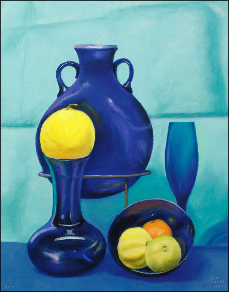
FINISHED 1-26-10 The deepest blue just got deeper, (it's around the neck of the top piece). Art Alternatives brand has the deepest blue pastel on the market, PB:15. The greatest thing about still life's is the control of the contrasting colors. When I'm out on location looking for my next painting it's all about color contrast or historic interest. Contrasting opposite colors always look good together. Look at the darker orange and darker yellow-green in the shadows in the large and small lemons, dividing into the two colors of the same value making those shadows. |
|
|
Art Alternatives.
To Laurie Seibold:
Let me add to your testimonials; "I've been painting on location in Maui, Hawaii for 30 years. I have over 300 cataloged pastels and nowhere in my collection is a stick of PR122 magenta. I bought your 24 color set just to get that color, not knowing that I would get a full strength PB:15 cyan phthalo blue and a dual-toned Indian yellow at the same time. I'm very pleased with all of your pastels. They work very well with my Real Color Wheel matching pigments to nature. This latest pastel has been amazing. I'm working on a board with acrylic texture on it. That means I can revert back to the bare board anytime I feel like it. I'm working on the computer and the painting all throughout the day, and night. Since my flowers are showing signs of aging I have been changing the painting as I rework new areas to keep up with the flowers. I just love being an artist."
|
|
Laurie sent me a box of 48 pastels. The bright Opera magenta pastel along with bright yellow, red and orange are great additions to go along with the medium and dark true magentas. Eight yellow oxides and orange and red tints round out a beautiful set of pastels with the highest color brilliance and chroma ever made in pastels. Art Alternitive has 42 colors plus grays. Tip: Thalo blue (cyan) is a very small molecule and very tenacious. I first noticed it getting on my white pastels, than the keys on my keyboard. Latex medical gloves are so perfect for protection and to spread pure pigment around on the support, it doesn't "pick-up" color, it paints with it and spreads it around. Today is 2/11/10. It is now 3:24 PM
Tools I need:
Use your gloved finger to solidify the pastel and color smooth down the pastel area you want to harden with a spray of water. To blend without removing any of the chalk use the latex glove or a small baggie over a Q-tip, your finger will make small piles of pigment, Why waste them, move and solidify the dust with the latex glove. (or) stand it up and tap off the loose dust and blow off with a straw anything stuck on, lay it back down flat. You can spray away. The colors won't lose their dry brilliance after they are dry unlike the way chemical sprays do. Doing nothing to the final pastel is best. Wet down and dried pastel. Now is the time to lean the dry board forward. You will find the pastel will have hardened where you can peal off layers of color as they were laid. You only need a light touch as the suffice is very receptive to the lightest touch of the hardest pastel. This is a very important feature I think, being able to use a stiff brush down to the layer you wet last. A chamois leather will wipe it clean since the last water spraying also. All that you are taking off is new chalk. I wish there were a way to cut each 1/2" wide stick into four long 1/4" or eight 1/8" sticks, that would make fine details possible, Prismacolor Pastel pencils will do but they are not as soft. Maybe I could wet them down an roll out a 1/8" pastel. Today is 2/18/10. It is now 2:11 AM, Finished, 12 days. My Red Ginger is long gone but I got it finished before the last bloom of pure magenta disappeared. The tea leaves are half brown, half green and yellow. The pink Mink is opening more and has lost most of it's pale pink. All and all, I had a great time. I didn't use any black pastel and was forced to use opaque colors. I respect the medium and it's ability to change colors one after another. Blending is the most pleasurable of any media. It's just more fragile than fresco but in a different way.
8-22-13, It's been a couple of years since I did a pastel, there was an orchid downstairs and I thought it would make a good one.
What I see on my drawing table, the colors I used at the end, bowl of water, sprayer, small stiff brush, mouth fixative blower, Q-tip covered with a thin baggy, chamois, wet rag and a magnifying glass. I added something new, Dagas used it, a milk casein pastel fixative. Water is a good intermediate fix while the work is still in progress. pastelproteaEha5-10-14.htm 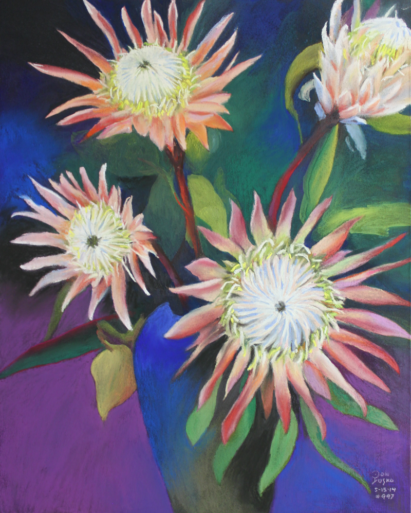
Links: Solitude | 10x10 in. | Soft Pastel on Wallis Professional
BRANDS: Hard and Soft Pastels
Pastel Binder
Author: Phyllis Franklin, Contributing Editor Original article w/ instructional photos. Pastel is the most basic way to work with pigment, because in the pastel technique, pigment is practically left in its natural state and is bound with minimal amount of natural glue. There is a large variety of natural glues (see watercolor binders) that can be used in Pastel-making, starting with any sort of starch methylcellulose (Tylose), Tragacanth or cooked oat-meal. Tragacanth is best suited for pastel-making, because it has a very high pigment binding strength, while not sticking to itself. This means that if you have gum Tragacanth on your fingers, they won't stick together. The Gum Tragacanth (full strength) is prepared with the following ingredients:
Directions:
* In order to adjust for the required varying levels of Gum Tragacanth, the Gum Tragacanth should be thinned into the following proportions:
How to Make Pastels
This is the basic formula for Pastel Making. To figure out required Gum Tragacanth Solutions and amounts of Champagne Chalk, further experimentation is suggested.
Solution B)
Solution C)
Solution D)
Solution E)
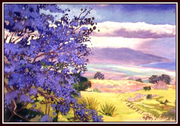
For more Life Drawing Pastels click here, new window. Human Proportions I learned and use for the human figure, new window. NEXT Opera w/c painting, operamagentasilk-greencarnations-wc11x15.htm PREVIOUS Jacaranda Season 2009, 15x22 Acrylic #953, jacaranda2009lowerkula.htm JUMP, Links to All Watercolor Paintings on Location
|