The Painter in Oil.
It is better in fact to settle on one kind of surface which suits you, and to have a few practical sizes of stretchers which will pack together well, and work always on these. You will find that by getting accustomed to these sizes you work more freely on them. You can pack them better, and you can frame them more conveniently, because one frame will always do for many pictures. Perhaps there is no one piece of advice which I can give you which will be of more practical use outside of the principles of painting, than this of keeping to a few well-chosen sizes of canvas, and the keeping of a number of each always on hand.
Don; I started my Maui paintings in 1976. Water colors were my main medium for 10 years so my standard sizes were based on a full sheet of water color paper, 22x30. The next sizes were just cut in half, 22x15, 11x15, 11x7.5, 5.5x7.5. Acrylics, pastels and oils used the same cut sized boards.
Absorbent. - Some canvases are primed so as to absorb the oil during the process of painting. They are very useful for some kinds of work, and many painters choose them; but unless you have some experience with the working of them, they are apt to add another source of perplexity to the difficulties of painting, so you had better not experiment with them, better to use the regular non-absorbent kinds.
Don; "Non-absorbent canvas is acrylic primed. Acrylics are what I prime my white oil palette with, it makes the dry oil paint come off easier. A perfect gesso job with glue, chalk and whiting won't show any absorbing or colorization either, or crack when a finger is poked in the back. Oil prime for oil paint is classical."
These three larger and thicker (brush) sizes come in very useful often and it would be well if you were to have these too. Sometimes a thick, long sable brush will serve better than another for heavy lines, etc. All these brushes are round. One largish flat sable like this would be well to have, but these are all the sables necessary.
Don; "This "etc." may be the missing round ferrule, flat end hair. It's not on the market anymore and was very important. Back when they were called riggers and liners (1970's) before Mr. Langnickel died. A rigger has a round furrel and has no point because it's flat at the end. It's my most used style of brush, 1/2" long & 1/8" wide.
Don; The fan brush, is a useful brush, not just to paint with, but to flick or drag across an outline or other part of a painting when it is getting too hard and liney. You may not want it but once a month, but it is very useful when you do want it.
They will need a careful soap-and-water washing every little while, beside..The liquid best for use in this cleaner is the common kerosene or coal oil..Never use petroleum "sprits" to rinse your brushes. It will make them brittle and harsh; but the kerosene will remove all the paint and will not affect the brush.
Page 2/10
The Painter in Oil, by Daniel Burleigh Parkhurst
CHAPTER V: PAINTS
In as much as certain colors are not claimed to be permanent and others are, it is for you to compose your palette of those which will combine safely. This you can do with a little care. Some colors are permanent by themselves or with some colors, but not in combination with certain others..You should then take the trouble to consider these chemical relationships.
Don; There were a lot of lead pigments in 1900, but not so today. Lead is effected by sulfur and turns brown. 2012, that problem has been beaten, Natural Pigments has encapsulated light lead colors so they can now be used with copper pigments and any other pigments that are effected by lead. This includes white.
COLOR LIST (In Bouguereau's time)
Whites. - Zinc White is the only permanent white, but it lacks body and is little used. The lead whites, flake, silver, cremnitz, will darken in time, and will turn yellow with oil, and may change with or affect change in other pigments. The zinc white is liable to crack. We have no perfect white, so practically, you may consider the lead whites as permanent enough, as other painters do.
Yellows - Cadmium (1797) is permanent in all three of its forms. It is a color the permanence of which is of great importance; for its brilliancy is quite essential to modern painting, and if it were not permanent, the picture would soon lose the very quality for which the color was used. The chromes, which are of similar color-quality, are less permanent, and are almost sure to turn to a sort of yellow-green, which when used was bright and sparkling, it will, in a few months, lose its freshness.- cadmium will not do that. Cadmium is also to be preferred to chrome, because it is of a much finer tonality. Greens and yellows made with the mixture of chrome are apt to be crude as compared with those in which cadmium is used.
Don. "The Chrome Yellow was used by Van Gogh and today, 2012, his yellows are anything but bright yellow. From 2010 to 2013 Rublev (Natural Pigments) has distributed a very bright full and tinted encapsulated yellow that Van Gogh would have cried for."
Don; Strontium Yellow is a permanent and most useful light yellow, one of the few cool yellows. Much to be preferred to all other citron pigments except the pale cadmium, and can be used in place of that if necessary. They are both expensive colors of about the same cost.
Naples Yellow was a very prominent pigment with the older painters..It is still very much used, but in the simplification of your palette you may as well leave it out, as you can get the same qualities with cadmium and white. It is durable and safe, but adds another tube to your palette which you can well dispense with.
Don; "I have to say Naples yellow is not replaceable with ordinary lead and cadmium. The dried chip color may be the same but antimony lead is very opaque and dries very fast. Before 1900 it was available in six different tints from greenish to reddish."
Don; "This matches the Real Crystal Color Wheel For Artists, Warm Cad Yellow Light pigment color darkening to warm Burnt Umber in 10 stages."
The ochres are among the oldest and safest of pigments. You can use them with any colors which are themselves permanent. There are several of them, a yellow ochre, Roman ochre, transparent gold ochre, and others. They are all native earths, and though they contain iron, they are sufficiently inert to be thoroughly sound colors.
The siennas, burnt and raw, are like the ochres, native earths, very old and permanent colors, and may be used anywhere.
The umbers are in the same class with the siennas and ochres.
They should all rank among the dark yellows or medium oranges.
Don; "Below is incorrect information, propagated by petroleum when this was written by Parkhurst years after Bouguereau's death."
Indian yellow and yellow lake should both be avoided as fugitive.
Don; Indian Yellow was permanent. Newer replacements at the time were not. The newest replacement is isoindolin, a nickel dioxine complex and it is permanent as was the original Indian Yellow."
Don; "More incorrect information". Aureolin is a rich, warm golden yellow of the greatest permanence, and should.be used when Indian Yellow and yellow lake would be used if they were permanent.
Don; "Isoindolin is a good replacement for Indian Transparent Yellow Golden. Aureolin is not transparent, it's translucent as is gamboge, now that there is a good permanent transparent Indian yellow why would anyone use any less?"
Reds - The vermilions are permanent when well made.
They are of great body and power, as well as delicacy. They are of two kinds, Chinese, which is bluish in tone, and scarlet and orange vermilion, which have the yellow quality. Both kinds are useful to the palette because of the practical necessities of mixing.
Don; Light red is a deep, warm red earth, made by calcining ochre, and has the same permanence as the other ochres. It is.a fine color, of especial value in painting flesh, and mixes with everything safely.
Don; "Madder is not transparent red, it's transparent magenta, Quinacridones are permanent."
The madders-rose, pink, purple, and madder carmine are the only transparent "reds" which are permanent.
Don; "Out dated info. These pigments have been replaced. Matter was not permanent by today's standards."
Whatever the name given them, they should not be confused with the lakes, which are absolutely untrustworthy. By reference to the plates you will see that the madders are practically the same as the lakes in color when first used. But the lake fade and the madders do not. The madders cost about twice as much as the lakes; but you must pay the difference, for the lakes cannot be made to stand, and you must have the color. There is nothing for it but to pay twice as much and buy the madders.
The lakes - scarlet, geranium, crimson, and purple - are all bad. The madders and lakes are all slow dryers; but unless carelessly used with other colors which are not yet dry they need not have a bad effect on the picture from cracking. Distinguish the madder lakes and the lakes, and between carmine, which is a lake, and madder carmine, which is a madder.
Blues - The ultramarine of the old masters is practically unused to-day because of its cost. But the artificial ultramarines, while not quite of the same purity of color, are equally permanent, and are in every respect worthy to be used. Of these, the brilliant ultramarine is the nearest in color to the real lapis lazuli. The French ultramarine is less clear and vivid, but is a splendid deep blue, and most useful.
Don; "1950 info. Today permanent blue transparent is permanent."
The so-called permanent blue is not quite so permanent as its name implies, but permanent enough for practical purposes.
"Cerulean Blue is a tint of Thalo blue which is the pigment transparent cyan."
One is very light and clear, the other darker, which are made of oxide of the metal cobalt. In oil they are permanent, and do not change when mixed with other colors. For delicate tints, when the tones are to be subtly gray yet full of the primary colors, the cobalts are indispensable. You should always have them on hand, and generally on your palette. Cerulean blue is of less importance than the other, but in very clear, delicate, blue skies it is often the only color which will get the effect.
Don; "Old info. Permanent Cyan Thalo Blue is the new replacement for Prussian Blue."
Prussian blue possesses the depth and power and quality of color which make it unique. The greenish tone gives it great value in certain combinations as far as its tinting effect is concerned. But it is not reliable as a pigment..It changes under various conditions, and fades with the light..It is not to be depended upon. Antwerp blue, a weaker kind of Prussian blue, is even.more fugitive. It is a pity that these colors will not stand, but as they will not, we must get along without them.
Don; "Poor grade indigo, the highest quality was cyan transparent hue, back when India made it and Egypt made the opaque cyan scarab."
Indigo has a certain grayish quality which is useful sometimes, but it cannot be placed among the even moderately permanent colors.
Don; "Thalo green new cleaner replacement for Veridian."
Viridian, or emeraude green, is the deepest and coldest of our greens, and is permanent. It is too cold, and looks even more so at night. In use it needs the addition of some yellow which holds its own at night, such as yellow ochre, or the painting will be impossible in gaslight, or even worse under electric light.
Emerald green is the same as the French Veronese green, and is generally permanent. It is said to turn dark, and does lose some of its brilliancy with time and the effect of impure air. But there are places where one needs it, especially in sketching, and it is well to use it sometimes..But bear in mind that it is not absolutely permanent, and as the quality that it gives, brilliant light green, is the very one it will lose should it change, don't expect too much of it.
Don; "No way, Emerald Green is copper arsenate, the most poisonous of all colors. Freach Veronese was a ferrous hydroxide plus silicic acid, native, "Veronese green earth", "tirolean", "bohemian", translucent."
Other colors - You will notice that I have said nothing about the various browns and olives and purples. It is simply because it is better for you to make all these colors than to get them in the tubes.
The earths and the browns of madder are all good, and the mixing of madders and good blues will make all the shades of violet and purple you can possibly want in their purity.
Palettes - We have, then, a number of pigments which are solid and safe, of each of the primary colors, and of such variety of qualities that the whole range of possible colors is practicable with them in combination. To recapitulate, let us make a list of them.
Don; "Notice how many madder's there are, Rose Madder was the closest to magenta. Magenta was always an important color in the past. It was not named magenta but the color was there. There is no transparent color represention for transparent cyan in this palette, only the opaque cerulean. It was like that for many years."
.THE PERMANENT COLORS.
.ZINC WHITE.
.LEAD WHITE.
.LIGHT RED.
.ROSE MADDER.
.CADMIUM YELLOW.
.PINK MADDER.
.CADMIUM ORANGE.
.PURPLE MADDER.
.CADMIUM YELLOW, PALE.
.MADDER CARMINE.
.STRONTIAN YELLOW.
.RUBENS MADDER.
.YELLOW OCHRE.
.ULTRAMARINE BLUE BRILLIANT
.ROMAN OCHRE.
.ULTRAMARINE BLUE FRENCH
.TRANSPARENT GOLD OCHRE.
.PERMANENT BLUE.
.RAW SIENNA.
.COBALT.
.BURNT SIENNA
.CERULEAN BLUE.
.RAW UMBER.
.IVORY BLACK.
.AUREOLIN.
.BLUE BLACK.
.CHINESE VERMILION.
.VERIDIAN.
.SCARLET VERMILION.
.EMERALD GREEN.
.ORANGE
.VERMILION
.TERRE VERTE.
Here is a list of colors which will work well together, and with which you can do as much as is possible with colors as far as our present materials go. Most of these colors, I am aware, are among the expensive ones. This I'm sorry for, but cannot help. The good colors are at times the expensive ones, but as there are no cheaper ones which are permanent to take their places, it would be the falsest of economy to use others.
Palette Principles - In making up your palette, you must so arrange it that you can get pure color when you want it. There is never any trouble to get the color negative, to get richness and balance is another matter.
If you will refer to the color plates, you will see that in each of (sic) Parkhurst's three primary colors there are pigments which lean towards one or the other of the other two. The scarlet red is a yellow red.
The Chinese vermilion and the rose madder are blue reds. The same holds with yellows and blues, as orange cadmium is a red yellow. This is, in practice, of the utmost importance, in the absence of the ideal color, for when we deal with the practical side of pigment, we deal with very imperfect materials which will not follow in the lines of the scientific theory of color. If we would have the purest and richest secondary color, we must take two primaries, each of which partakes of the quality of the other.
Don; Like Parkhurst said, the red-yellow-blue palette doesn't work. What he doesn't say, because we didn't have the colors yet, is that the primary colors are transparent yellow PY153 orange side and PY154 brown side, transparent magenta PR122, and transparent cyan PB15
To make a pure orange, for instance, we must use a yellow red and a red yellow. If we used a bluish red and a bluish (greenish) yellow, the blue in both would give us a sort of tertiary in the form of a negative secondary instead of the pure rich orange we wanted. This latter fact is quite as useful in keeping colors gray without too much mixing when we want them so, but nevertheless we must know how to get pure color also.
Don; "Today we can make a red or orange with transparent yellow and transparent magenta."
Characteristics have a bearing on the setting of our palette, for we must have at least two of each of the three primary.colors - red, yellow, and blue - and white. There may be as many more as you want, but there must be at least that number.
Don; "Cyan was Prussian Blue in 1900 but it is not mentioned in his pigment list, only the opaque Cerulean blue. Artists at that time were just learning about the transparent primary cyan.
Don; "Today's progression of colors is this: yellow, orange, red, crimson, magenta, purple, blue, cobalt blue, cyan, turquoise, green, yellow-green. That is the yellow-magenta-cyan color wheel, not the red yellow and blue colorwheel."
Don; "These artist's painting from 1800 to 1909 made use of this transparent Indian Yellow pigment until it was abruptly removed from access by the maker Winsor Newton in 1909, a political move; Vigee-LeBrun, David, Friedrich, Ingres, Carot, Delacroix, Rousseau, Millet, Courbet, Whistler, Manet, Monet, Pissarro, Sisley, Renoir, Eakins, Dagas, Cezanne, Seurat, Gauguin, Van Gogh (on occasion), Sargent, Ostroukhov, Ripin, Serov, Matisse, Vlaminck, Derain, Bellows, Savrasov, Pukirev, Perov, Shishkin, Vasilievich, and Polenove."
"1826, COLOR, Permanent Alizarin was discovered."
"1870, COLOR, Cerulean Blue, opaque, permanent, Cobaltous Stannate, cobalt oxide and tin oxide."
Don. "Here is a better list of the pigments available to the great artists in 1886."
"1886-COLOR THE FIRST PUBLIC STANDARD OF PIGMENT COLORS FOR ARTISTS
A. W. Keim, German. "Deutche Gesellschatf zur Forderung rationeller Malverfahren", The German Society for the Promotion of Rational Methods in Painting, 1886.
They set up control for the pigments in colors found best by the artists, to guarantee the color's characteristics and ingredients. These are the colors deemed necessary by the artists in 1886;
1. White Lead, 2. Zinc White, 3.Cadmium Yellow Light, Medium and Orange. Cadmium Red wasn't discovered until 1909, 4. Indian Yellow, 5. Naples Yellow Light and Dark, 6. Yellow to Brown, Natural and Burnt Ochers and Sienna, 7. Red Ocher, 8. Iron Oxide colors, 9. Graphite, 10. Alizarin Crimson Madder Lake (a Magenta colored fugitive pigment by today's standards), 11. Vermilion, 12. Umbers, 13. Cobalt Blue, Native and Synthetic, 14. Ultramarine Blue, Natural and Synthetic, 15. Paris-Prussian Blue, 16. Oxide of Chromium Opaque and Transparent Viridian, 17. Green Earth, 18. Ivory Black, 19. Vine Black.
Don; "These colors below are very correct in 1900 and today. The cyan hue
Indigo or Prussion.Blue is missing in Parkhurst's palette, also the transparent yellow."
Don; "Today, PR122 Magenta is a pigment much stronger in tinting strength than Rose Madder. The color Thalo Green also strong and pure and is the opposition of PR122 Magenta. In the foreground the Ultramarine blue pigment talked about in the Landscape Palette below isn't needed to cool off the shadows in the foreground as much as the middle ground. Today this 3 color mix is matched in 2 colors. Because we have a great transparent purple, we can keep this to the two color mix maxuim. Purple and Green are split complements. By taking the Blue side tirtiary color of magenta, that would be purple, and mixing it with green. We would be adding a little extra cyan to the magenta. This color making technique of today would be a cleaner equal color to adding Ultramarine Blue to Rose Madder and Veridian."
Don; "In 1724 Prussian Blue was invented, it should have been in the Parkhurst 1900 landscape palette."
"In1800, W/N Indian Yellow is world wide. All and all, I do not think the Parkhurst palette is representative of the best palette at the time."
Don; "Bouguereau never mentions a specific palette, but Moreau-Vauthier is again helpful in this regard, he gives it as;
..Naples Yellow (lead antimonate)
..Yellow-Ochre
..Chrome Yellow, dark
..Viridian
..Cobalt Blue
..White Lead
..Light Vermilion
..Chinese Vermilion
..Mars Brown (iron oxide); this available from Lefranc & Bourgeois
Van Dyck Brown
..Burnt Sienna
..Ivory Black
..Bitumen *transparent oily yellow-brown*
..Genuine Rose Madder, dark *transparent magenta*
All of Bouguereau's colors are still available today as prepared artist's paints, but not from any single manufacturer.
In one of his sketchbooks, Bouguereau lists so many pigments that no palette could possibly contain them, but it is interesting to note all the possibilities he had to choose from.
1869 [Sketchbook No. 5]
Manganese oil -- Leclerc, rue St. Georges.
..White lead, (Silver White) Lead carbonate
..Ivory Black, Charred Ivory
..Minium, Red Lead
..Vermilion, Mercuric sulphide
..Brown Madder, Iron (charred) Cassius Red, Tin bioxide and gold protoxide
..Iodine Scarlet, (English) Mercuric iodine
..Purple Red, Mercuric chromate
..Madder Lake,
..Mineral Yellow, (Paris) Oxi-chloride of lead
..Charred Massicot, Lead bioxide and protoxide
..Minium, orange, Charred ceruse (lead)
..Chrome, Lead Chromate
..Orpiment, (King's Yellow) Arsenic sulphide or Yellow sulphide of arsenic
..Naples Yellow, Lead oxide and antimonate
..Ochre, Hydrated ferric oxide
..Indian Yellow, [?](It was a trade secret of W/N back then. The principal constituent of Indian yellow is a mixture of the calciun and magnesium salts of euxanthic acid.)
..Prussian Blue, Iron protoxide sulphate and prussiate solution
..Mineral Blue, Iron and [?]
..Ultramarine Blue, Lapis Lazuli
..Cobalt, Cobalt
..Smalt, Powdered cobalt glass
..Ash Blue, Copper
..Indigo, Vegetable *cyan*
..Violet, Charred iron peroxide Cassius, purple and alumina
..Verdigris, Copper acetate
..Scheele Green, Copper arsenate
..Mountain Green, Copper carbonate
..Chrome Blue, Chromium protoxide
..Cobalt Blue, (mineral) Cobalt and zinc
..Viridian, Sulfate of lime and copper aceto-arsenite
..Green Earth, silica, iron oxide, potassium, magnesia carbonate and water
..Sap Green, Unripe buckthom berries (lake)
..Cassel Earth
..Cologne Earth, Natural earth darkened mostly with Bitumen
..Umber, Natural earth colored with ferric oxide, manganese dioxide plus a little Bitumen
..Sienna, Ochreous natural earth and manganese (bioxide ?) hydrate
..Prussian Brown, Charred Prussian Blue
..Asphaltum, Bitumen
..Mummy, Asphaltum and bone ash
..Yellow Lake, Albumen colored with Avignon yellow grains
..Cadmium, Cadmium sulfide
..Azure or smalt, *Azurite or * powdered cobalt glass
A Landscape Palette in 1900.
- Landscape calls for pitch and vibration.
You must have pure color and great luminosity, yet a range of color which
will permit of all sorts of effects. The following will serve for everything
out-of-doors,..and I have seen it with practically no change in the hands
of very powerful..and exquisite painters. There are no browns and blacks
in it because the colors which they would give are to be made by mixing
the purer pigments so as to give more life and vibration to the color.
The Blackest note may be gotten with ultramarine and rose madder with
a little veridian if too.purple; the result will be blacker than black,
and have daylight in it. The ochre is needed more particularly to warm
the veridian. If you paint figures out-of-doors you will need this
same palette. Madder carmine or purple madder, and cerulean blue may also
usefully added to this list.
.WHITE.
STRONTIAN YELLOW.
.ORANGE VERMILION.
CADMIUM YELLOW.
.PINK MADDER.
ORANGE CADMIUM.
.ROSE MADDER.
YELLOW OCHRE.
.COBALT.
ULTRAMARINE.
.VERIDIAN.
EMERALD GREEN.
Don; The umbrella should be large and tight with a valve in the top to let the wind and hot air through, will be found cooler and less easily blown over.
You should have some strong rings sewn onto it, so that you can fasten it from four sides by strings, to keep it steady if the wind blows hard. The umbrella should be of light-colored material, preferably white; but if it is lined with black the shade will be better, black will give no false glow to the colors.
Don; "Real pictures grow from the study of nature."
There are changes which can be made, and be right - made as nature might make them. Other changes which would be false to nature's ways, and false to art also. For art works through nature always, and in accordance with her.
This is the aim of the painter, to express ideas though nature, not to express notions about nature.
Methods. - Two general methods are at the command of the student from the first, - to study at once from nature, or to copy. I think I may safely claim to speak for the great body of teachers who are also professional artists, in saying that copying is a means of study rather for the advanced student than for the beginner.
Get to Nature. - If you would really learn to paint, to see for yourself, to represent what you see in your own way, you cannot get to nature too soon. Don't bother about what the thing is, so long it is nature herself. By nature I mean anything, absolutely anything which exists of itself, not painted. Whether it be the living figure, or a cast, or a bit of landscape,.or a room interior - all things which actually exist must show themselves by the facts of light falling upon them: the relation of color, and the contrasts of light and dark. Whatever you see is useful to you in this way, for these bring about all the qualities and conditions which you most need to study.
Modeling. - In the same way that you have laid out the proportions in mass, lay out your Proportions of light and shade. Model your drawing by avoiding the small until the large variations of shade are in place. Avoid.seeing curves in relief as you have avoided curves of outline. Try to analyze the modeling into flat planes, each one large enough to give a definite mass of relief. Don't be afraid of an edge in doing this. Let your flat tone come frankly up to the next tone in stop. This again is not for any effective in itself, but only for facility exactness. Later you can loose it as much as you see fit in breaking up the drawing into the more delicate planes, and these again into the most subtle.
Study first the outline and then the planes. Constantly compare them as to relation; you will find it suggestive. Remember that your aim is to.produce a whole, not a lot of parts, and although a whole includes the parts, the parts are incidental.
Measurements. - You will always have to use measurements for the sake of accuracy. Probably you will never be able to dispense with them. The best way would be to take them as matter of course, and get so that you make them almost mechanically, without thinking of it. You will save yourself an immense deal of time and trouble by accepting this at once, for accuracy is impossible without measurements, and the habit of accuracy is the greatest time-saver.
Hold your charcoal in your hand freely, so that your thumb can slip along it and mark off parts of the object when you sight at them across the coal. Measure horizontal and vertical proportions into themselves and into each.other. Height and breadth are checks to each other. If the height is a certain proportion of the breadth, then the smaller proportions of height must have equivalent proportions to each other as well as to breadth. Measure these and you are sure of being right.
Steps. - Divide your drawing into steps or stages of work. You will find a helpful thing in studying. You will do it quite naturally later. Do it deliberately at first, as a matter of training.
*First step. - Measure the extreme height and breadth of the whole group or object of your drawing, with accuracy, and mark each extreme.
*Second step. - Outline the great mass of it with the simplest lines possible. Give the general shape of the whole. This will block it in.
*Third step. - Measure each of the objects in the group, or the parts most prominent, if it be a single object. Measure its height and breadth, both in its own proportion and in proportion to the dimensions of the.other parts and of the whole. Enclose it in straight lines as you did with the whole.mass.
*Fourth step. - Find the more important of the lesser proportions in each object, and block them out also. This should map out your drawing exactly and with some completeness.
*Fifth step. - Lay in simple flat tones to fill in these outlines, and keep the relations of light and dark very carefully as you do so.
*Sixth step. - This should leave your paper with a few large masses of dark and light, which can now be cut into again with the next smaller masses, giving more refinement to the whole. This also should so break up the edges as to get rid of any feeling of squareness or edginess.
*Seventh step. - Put in such accents of dark, or take out such of light, as will give necessary character and force to the drawing.
Chiaroscuro is an Italian compound word whose two parts, chiar and oscuro, signify simply bright and obscure, or light and dark.
Don. 'bright and obscure'. Means the light source is obscure. Like a candle behind a hand or any light source hidden.
Primaries and Secondaries. - As all the other shades of color are produced by the combinations (over-lappings) of the waves or vibrations in the light rays from the primary colors,
Don. He is using the old primaries of Red, Yellow and Blue.
We have a series of colors called secondaries, because they are made up of the rays of any two of the three primaries: as purple, which is a combination of blue and red.
When dealing with light the secondaries are: shades of violet and purple from red and blue; shades of orange red, orange, orange-yellow, yellow, and yellowish green from red and green; and bluish green and greenish blue from blue and green - the character of the color being decided by the proportions of the primaries in the mixture.
Don. He used the old primaries of Red. Yellow and Blue.
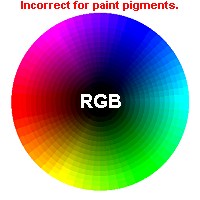
Don. "This is the first attempt to make light RGB behave as pigment."
These conclusions have been reached mainly through experiments in white light. The primaries so obtained do not hold good with pigment, as I have stated, but the principles do.
It will avoid confusion if I speak hereafter of the combinations as they occur with pigment, it being borne in mind that it is a practical fact that we are dealing with rather than a scientific one.
Don. Parkhurst is in deep trouble.
Don. Here I am really against our writer.
In dealing with pigment the primaries are red, blue, and yellow, not green.
Don. The fallacy of thinking in RYB as primaries:
If red, yellow and green are the primaries of light, just change the green to yellow and it might work in pigments.
Of course the secondaries are also changed; and we have purple and violet shades from red and blue, orange from red and yellow; and green from blue and yellow - all of which vary in shade with the proportion of the mixture of the primaries, as is the case with light.
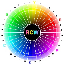
Don. "He has the light primaries right and the pigment primaries wrong...He is using light's RGB blue as the pigment blue. Pigment blue, (Ultramarine Blue) is a secondary color on the YMC and RCW Crystal Element Color Wheel, Real Color Wheel, 'RCW' for short."
Tertiaries. - Another class of shades or colors is called tertiary, or third; for they are mixtures of all the three primaries, or of a primary with a secondary which does not result from the mixture with that primary.
Tertiaries are all grays, and grays are practically always tertiaries. If you keep this in mind as a technical fact, it will help you in management of color.
Don. "That was bad teaching, I remember having to do this drill in college, with the wrong primaries. 1962>"
Don. "Tertiaries are colors all right, colors next to the secondary colors in a 12 color wheel."
Grays are, to the painter, always combinations of color which include the three primaries. The usual idea is that gray is more or less of a negation of color. This is not so. Gray is the balancing of all color, so that any true harmony of color, however rich it may be is always quiet in effect as a whole, that is, grayish -good color is never garish.
Grays made by mixing black with everything are the reverse, and should not be used except when you use black as a color (which it is in pigment), giving a certain color quality to the gray that results from it.
Don. Double talk BS.
Complementary Colors - Two colors are said to be complementary to each other when they together contain the three primaries in equal strength.
Don. "That's correct, but watch what he does with it and the wrong primaries. This is not Bouguereau speaking remember, it's Parkharst. Bouguereau was the best artist alive in 1899."
Green, for instance, is the complementary of red, for it contains yellow and blue; orange (yellow and red) is complementary to blue and purple, (red and blue) is complementary to yellow.
Don. "And there you have it, the RYB color theory in the late 1800's. All those complements mix brown, not neutral. All the rest is incorrect, the RedYellowBlue colorwheel doesn't work. It doesn't contain magenta or cyan."
The Palette. - You try to attain nature's effects of light with pigment. Pigment is less pure than light. You cannot have the same scale,
Don. Yes you can, with the right set of transparent pigment primaries."
Transparent color should not be used alone, but only to modify the tint of the more solid pigments for the transparent colors used indiscriminately are apt to crack.
Don. "Today's transparent colors don't crack."
That characteristic is avoided when the heavier color forms the body of the paint.
Solid Painting. - In most cases solid painting is the safest, -- the least likely to crack, and the most safely cleaned from varnish and dirt without injury to the paint itself. It is firmer in character too, and gives more solidity of effect to the picture.
Don. Here we are out of the classic range, I don't know why he (Parkhurst) conceders himself a student of Bouguereau, he has left behind good classical blending techniques and moved on to Impressionism.
Mixing. - In mixing colors you should be careful not to over mix. Dont stir your paint. Too much mixing takes the life out of the color. Particles of the pure color not too much broken up by mixing are valuable to your work, giving vibration and brilliancy to it. The reverse is muddiness, which is sure to come from too much fussing and overworking of wet paint. Dont use more than three pigments in one tint if you can help it, and mix them loosely. Put all the colors together, one beside other, drag them together with the brush, scoop them up loosely on the end of it, and lay the tint on freely and frankly. Never muddle the color on the canvas.
Dont put one color over another more than you can help, you will only get a thick mass of paint of one kind mixing with a mass of another, and the result will be dirty color, which of all things in painting is most useless.
Don, I have to stop here, his colors are wrong.
|