RCW
The Original REAL COLOR WHEEL by Don Jusko

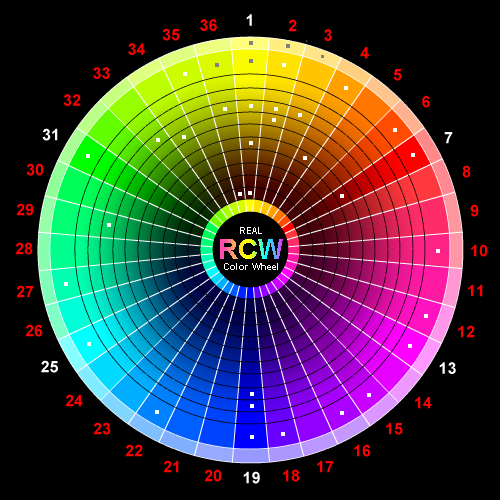
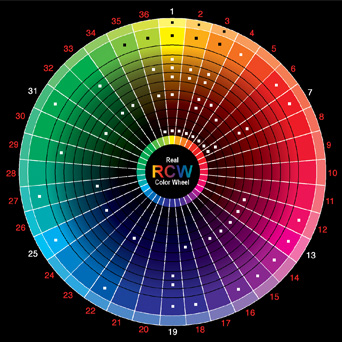
This is the only color wheel like this in the world, it makes sense.
All other color wheels in the world will not match these pigment oppositions
or the way colors get darker.

Real Color Wheel - Link to Main Page

Here is an "off my site" page about pigments.
It gives a lot of pigments of the past and present with their chemical composition.
It only uses the dried chip color so it's not accurate for dual-toned colors.
It also bases color on the red-yellow-blue color scheme so there is no magenta (Pale Redish to medium purple) or cyan (Bright blue green Shade).
But it does list all the manufactures of each color, by their own standards, and the manufactures color charts and pigment names, it's a good resource site.
It does show the mess we are in classifying colors to the Red, Yellow, Blue color wheel.

Real Color Wheel Comparison Chart
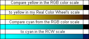
NOTICE that the RGB scale goes to black,
this adds green to yellow and cyan colors.
RGB has the yellow and cyan darker pigments in the wrong place.
Naples yellow, ochers & umbers are not under yellow where they should be.
Use the Real Color Wheel in your Art Pad and all painting techniques

NEW page link, 2013, Hexidecimal Codes and colors for print and computer artists.


All dots are links to pigment colors. The center links to the photo color chip chart.

All dots are pigment links Naples Yellow Light Naples Yellow Deep Acrylic Vivid lime Green, Oil Yellow Green Opaque Brilliant Yellow Green, translucent in acrylics Cadmium Yellow Raw Sienna, translucent Cadmium Yellow Medium Raw Sienna, translucent Cadmium Orange, opaque Green Gold, Transparent Indian Yellow-Orange Lake Extra Yellow Raw Ocher, Opaque Translucent Yellow Oxide Chinese Vermilion Extra Permanent Green light Chromium Green Oxide Indian Yellow-Brown Transparent Burnt Sienna, translucent Cadmium Red Light, Opaque Thalo Green, transparent Raw Umber, translucent Burnt Umber, translucent Venetian Red Oxide, Opaque Opaque Green Light Pigment Photo Chip Chart Pigment Photo Chip Chart Rembrandt Rose, Translucent Turquoise Blue-Green, transparent Quinacridone Magenta, Warm Thalo Blue, Transparent Cobalt Magenta, Cool Ultramarine Blue, Translucent Ultramarine Blue Light Carbazole Dioxazine Purple, transparent Cobalt Blue French Ultramarine Blue Ultramarine Violet, Transparent

Real Color Wheel Matching Tube Pigment Colors and RGB, HTML

***


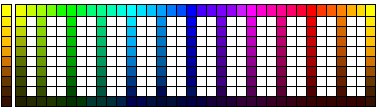
Test your monitor, the top button is the deepest Black.

The next radio button is White. The next radio button is White.

Or a cool neutral tint. #"CCCCCC" R=180, G=180, B=180, CMYK= 20Y 40C 20M, RCW= Any triad or complementary set of colors, plus white.

Enter a color name or hexidesimal code, FFFFFF = White (all colors full, the numbers 000000 = black (no color). Use numbers in groups of 33 to be web safe. Examples: FF0000 is red, 990000 is a dark red color red and no other colors, 660000 is a darker red, 33000 is very dark red. 00FF00 is green, 0000FF is blue, CCCCCC is neutral gray. Here is a new page with a thousand colors and codes.

Enter any color name or Hexidesimal color code.


Top-tone is adding White to the color. Under-tone is adding clear. Mass-tone is thick out of the tube.
Click the radio button to change the background to the matching tube color.

I think a spectroscope of dried pigment color would show all colors to be impure but this can't always be shown on the web. The percentage CMYK was from mathematical printed chart and matched to the tube color by eye.

I matched the dried chip color to the computer by eye. It's close enough to paint with a computer tablet and compare the relationships of similar colors in pigments.

I matched the pigment tube color dry to RGB color and read it with a Digital Color Meter.

Top-tone is adding White to the color. Under-tone is adding clear, like water or oil. Mass-tone is thick out of the tube pigment. Click the radio button to change the background to the matching tube color.


#1.01.1, Rembrandt Nickel Titan Yellow Light, a cool tint pigment. #"F1F0A7", R=241 G=240 B=167.

#1.1.1, Mussini Zinc Yellow, the coolest full chroma Yellow. An extra color on the palette. #"F1F10A", R=241 G=241 B=010
To mix a dark neutral, use the darkest form of opaque yellow #1.10.1, Mussini Burnt Umber. Note: Cadmium Yellow also darkens to this color in the "Real Color Wheel" using this brown to form all warm yellows. #"331500", R=51 G=29 B=0

#1.0.2, Mussini Cadmium Yellow Pale, a slightly cool Yellow. #"FFFA43", R=255 G250 B=067
Opposite color = 19.0.5, Blockx French Ultramarine Blue, translucent. #"150036", R=21, G=0, B=36
To mix a dark neutral, use the darkest form of opaque yellow, #1.10.9, Mussini Burnt Umber and mix it 1:1 with its opposite color, Ultramarine Blue.
Do that with each of the colors in this arc #1 to make a neutral dark or neutral gray.

#1.0.3, Bellini Lemon Yellow, Lead Chromate, a light cool Yellow. #"FAFF28", RGB, R=250 G=255 B=098.
To mix a dark neutral use the darkest form of opaque yellow 1.10.9, Mussini Burnt Umber.

#1.0.4, Grumbacher Cadmium Barium Yellow Pale, a middle Yellow. #"FFFF0E", R=255 G=255 B=14.
To mix a dark neutral use the darkest form of opaque yellow 1.10.9, Mussini Burnt Umber.

#1.0.5, Mussini Cadmium Yellow Lemon, the middle Yellow. #"FFFF00", R=255 G=255 B=010.
To mix a dark neutral use the darkest form of opaque yellow 1.10.9, Mussini Burnt Umber.
Opposite color = #19.0.5, Mussini Ultramarine, translucent. #"150064", R=21 G=0 B=100.
To mix a dark neutral use the darkest form of opaque yellow, 1.10.9, Mussini Burnt Umber.

#1.0.6, Dual-tone Gamboge, changing to this Cadmium Yellow under-tone. #"FAFB32" R=250, G=251 B=50
#1.2.2, Old Holland Gamboge Lake Extra, Mass-tone, a Yellow-Orange dual-tone color, #"EFCA40", R=255, G=159 B=000
Opposite color = #19.0.5, Mussini Ultramarine, translucent. #"150064", R=021, G=000, B=100,
To mix a dark neutral use the darkest form of opaque yellow, 1.10.9, Mussini Burnt Umber.

#1.0.8, This is the Under-tone color of Old Holland Indian Yellow/Brown Lake Extra Dual-tone. #"F6E45B", R=252 G=225 B=70.
#1.4.8, Mass-tone, Old Holland Indian Yellow-Brown Lake Extra. It makes a good dark triad neutral, but not a strong Yellow, more like a Cadmium Yellow Middle Under-tone. (Old Holland Indian Yellow Brown Lake, has a Warm Tan Ocher top-tone with a Middle Cadmium Yellow undertone. It makes a poor Orange but will turn Ultramarine Blue to a decent Neutral Dark if that is all you had on a three color palette.) We artists REALLY need this color in acrylics and water colors, not just in oils by only one manufacture. A Yellow/side Burnt Sienna if you will. #"986011", R=152 G=096 B=017.
It will lighten farther to very close to a pure yellow like the Yellow-Orange side Indian yellow. I use this color when I only use one Indian yellow or one yellow only. It's not like translucent Gamboge that you can recognize everywhere.
Opposite color = #19.0.5, Mussini Ultramarine dark, translucent. #"1A166B", R=26 G=22 B=107. This color Old Holland Indian Yellow/Brown transparent will also make a neutral dark when mixed with ultramarine dark.

#1.0.9, Here is the dual-toned Under-tone color of Old Holland Indian Yellow-Orange Lake Extra. The pale undertone is a strong Yellow-Pale while the top mass-tone hue is Orange and Vermilion mixed 1:1.#"FFF000", R=255, G=240, B=000, To make a dark neutral use 1.10.9, Mussini Burnt Umber. Note: Cadmium Yellow also darkens to this color in the "Real Color Wheel" using this Brown to form all warm Yellows. #"331500", R=51 G=29 B=0
#4.0.1, Old Holland Indian Yellow-Orange Lake Extra mass-tone, a dual-toned Orange to Yellow transparent color. #"FF5700", R=255, G=87, B=0 This color can replace the famous "golden transparent", one of the two color aspects of Natural Indian Yellow.
Opposite color = #19.0.5, Mussini Ultramarine dark, translucent. #"150064",

#1.10.5, Rembrandt or Mussini Asphaltum, the ancient color Bitumen, a transparent dark brown/yellow side, Rembrandt used this favorite glaze to transcend dark (Doerner). The Smithsonian says he did not use this color? Don't use this pigment it is much too oily, Rembrandt had no other choice at that time, he used it as his last glaze. #"331D00", R=51 G=29, B=0. New in Liqutex, transparent Van Dyke Red Hue, mixes neutral with Ultramarine Blue. Way to go Liqutex!
A transparent Under-tone of Rembrandt or Mussini Asphaltum or the new Benzimidazolone PBr:25.
Opposite color = #19.0.5, Mussini Ultramarine Light, medium or dark, translucent. #"150064", R=21 G=0 B=100

1.10.9, Mussini Burnt Umber, a calcined translucent warm Red-Brown. Note: Cadmium Yellow also darkens to this color in the "Real Color Wheel" and iron based crystals, using this Brown to form all warm Yellows. #"331500", R=51 G=29 B=0
Opposite color = #19.0.5, Mussini Ultramarine Light, medium or dark, translucent. #"150064", R=21 G=0 B=100

#2.01.5, Mussini Naples Yellow Light (.01 means the mass-tone appears as or is a tinted color, .010 is the lightest tint before white) Mussini Naples Yellow Light is an opaque Nickel and Titanium replacement for Antimony Yellow. This was the traditional (1875) base flesh tone when made with Antimony Lead, later and earlier lead-tin Yellow was used. #"FFEDA8", R=255 G=237 B=168
Opposite color = #20.0.5, There is no opposite tubed color to make a neutral dark because there is too much white in the pigment to go dark.

#2.0.2, Schmincke Mussini Cadmium Yellow Middle is more Yellow than Grumbacher Cadmium Yellow Medium. #"FFED09", R=255 G=337 B=009
#2.0.6, Grumbacher Cadmium Yellow Medium. #"FFE709" R=255 G=231 B=9
Opposite color = #20.0.5, There is no pre-made tubed color in this opposite color arc #20.
To mix a dark neutral use the darkest form of opaque yellow, 1.10.9, Mussini Burnt Umber.

#2.3.5, Mussini Yellow Raw Ocher, opaque tan. #"9B6A26", R=155 G=106 B=038
Opposite color = #20.0.5, no pre-made tubed color.
To mix a dark neutral use the darkest form of opaque yellow, 1.10.9, Mussini Burnt Umber.
#2.4.5, Mussini Translucent Yellow Oxide, dual-toned red-tan, add white for a yellow-tan. It has the same mass-tone matching color as Mussini Indian Yellow Brown Lake Extra. #"986011", R=152 G=096 B=017
The top-tone of Mussini Translucent Yellow Oxide.
Opposite color = #20.0.5, no pre-made tubed color.
To mix a dark neutral use the darkest form of opaque yellow, 1.10.9, Mussini Burnt Umber.

#3.00.5, Mussini Naples Yellow Deep, (True Naples is either Green-side, Yellow-side or Red-side, higher firing temperatures make warmer, lighter colors. #"D9A878", R=217 G=169 B=120
Opposite color = #21.0.5, There is no pre-made tube color in this opposite color arc #21 because there is too much white in the pigment to go dark.

#4.0.1, Isoindolinone PY110, mass-tone, Old Holland Indian yellow-orange transparent, #"FF8200", R=255, G=130, B=0, dual-tone to cadmium yellow light
#1.0.5, Tint of Isoindolinone = Mussini Cadmium Yellow. #"FFFF00", R=255 G=255 B=0
Opposite color = #19.5.5, Ultramarine Blue Dark. They mix together to make a fairly good neutral dark.

#4.0.5, YYYM, Mussini Cadmium Orange, opaque. #"FF8200", R=255, G=130, B=0
Opposite color = #22.0.5, Mussini Cobalt Blue Light, or dark, opaque. Because both colors are opaque the final mixture is not dark but rather it's a lighter neutral gray. #"00255C", R=0 G=37 B=92

#4.6.5, Mussini Burnt Sienna, transparent Red-Brown. Orange changing to dark brown, goes through Burnt Sienna. The mass-tone from the tube #"4D0000", R=77, G=0, B=0
Opposite color = Cobalt Blue to Ultramarinelt Blue, these combinations can make a Burnt Umber or a neutral dark.
The under-tone (the pigment color with clear medium added) of Mussini Burnt Sienna.
The high top-tone tint of Mussini Burnt Sienna.

#6.0.5, Rembrandt Chinese Vermilion Extra, translucent, 10% more yellow than in red light pigment. #"FF3200" R=255 G=50 B=0
Opposite color = #22.0.5, cobalt blue to #19.0.5, ultramarine blue

#7.0.5, Cadmium Red Light. #"FF0000" R=255 G=0 B=0
Opposite color = #25.6.5, Grumbacher Thalo Blue mass-tone, transparent. A neutral dark can be made by adding any color from cyan to ultramarine blue. #"000040", R=000, G=000, B=064

#7.5.5, Blocks Venetian Red, warm opaque. Cadmium Red going to neutral dark black. #"A60000", RGB = R=153 G=0 B=0
Opposite color = #25.6.5, Grumbacher Thalo Blue mass-tone, transparent, a perfect Cyan. tint =

#12.0.5, Rembrandt Rose, transparent Scarlet-Crimson. #"F1004C", R=241, G=0, B=76
Opposite color = #27.6.5, Rembrandt Blue Green in it's mass-tone, a transparent Turquoise color. #"003020", R=0 G=48 B=48
The under-tone of this tube color.
The top-tone of Rembrandt Rose, the perfect Pink, notice it is getting cooler. #"FF4186", RGB, R=255, G=065, B=134

#13.0.5, Daniel Smith Quinacridone Magenta PR122, a warm dual-tone Magenta with a cooler mass tone similar to Cobalt Violet and a warmer top-tone, #"BD0053" R=189 G=0 B=83
The top-tone of PR:122, the perfect primary magenta. The pigment Opera is another perfect magenta but it's fugitive.
Opposite color = 31.6.2, Mussini Phthalo Green mass-tone is blue/side green, transparent. Thalo Green mixes to a perfect neutral dark. #"003010" R=0. G=48, B=16

#14.0.5, Bocour, New York, Cobalt Violet Phosphate, transparent dual-toned, dark mass-tone to a cool top-tone pink when mixed with White and a warm under-tone pink when mixed with medium. This color is perfect for making Ultramarine Blue using Thalo Cyan. Today this pigment is not available #"BD0081" R=163 G=0 B=109
Opposite color =#31.6.8, Grumbacher Thalo Green Yellow/Side, transparent. Has a warmer mass-tone than top-tone. #"003000" R=000, G=048, B=000
Cool top-tone.
Cooler top-tone with more White.
Warm transparent under-tone.

#16.0.5, Liquitex Carbazole Dioxazine Purple, transparent. With the addition of White, this pigment completely changes into a cooler color Purple, it is dual-toned: #"300030" R=048, G=000, B=048
Opposite color = 33.6.5, Hooker's green Permanent, transparent or translucent, depending on the brand. #"1A2813", R=26, G=40, B=19
A top-tone tint of this color Carbazole Dioxazine Purple.

#16.0.5, Grumbacher Dioxazine Purple, this mass-tone tube color looks like this:
Opposite color = 33.6.5, Hooker's Green Permanent, transparent or translucent, depending on the brand. #"1A2813", R=26, G=40, B=19
With the addition of White this pigment fills the warm slot. Here is the tinted color of this pigment Grumbacher Dioxazine Purple.

#18.0.5, Ultramarine Violet, translucent mass-color from the tube. #"260035", R=38 G=0 B=53
Opposite color = #36.10.5, Mussini Raw Umber, a translucent cool Brown/green side. #"332500", R051, G=037, B=000
Top-tone tint of this color Ultramarine Violet.

19.0.5, Blocks French Ultramarine Blue, translucent. #"150036", R=21, G=0, B=36
The top-tone tint of this color French Ultramarine Blue.
The opposite color = #1.0.5, Mussini Cadmium Yellow #"FFFF00".
To mix a dark neutral use the darkest form of opaque yellow, 1.10.9, Mussini Burnt Umber.

19.2.5, Mussini Ultramarine Light, translucent. #"150064", R=21, G=0, B=100
The opposite color = #1.0.5, Mussini Cadmium Yellow #"FFFF00".
To mix a dark neutral use the darkest form of opaque yellow, 1.10.9, Mussini Burnt Umber.
Top-tone tint of this color Mussini Ultramarine Light.

#22.0.5, Mussini Cobalt Blue Light, opaque. Nobody makes a true Cobalt Blue anymore. The artificial colors are in this Opaque Azure range. There are no transparent Azures available. #"00255C", R=000, G=037, B=092
Opposite color = #4.0.5, Mussini Cadmium Orange, opaque. #"FF8200", R=255, G=130, B=0
Because both colors are opaque the final mixture is not dark but rather it's a lighter neutral gray.
A top-tone tint of this color Cobalt Blue.

#25.6.5, Grumbacher Thalo Blue mass-tone, transparent, a perfect Cyan. This colors mass-tone resembles Ultramarine Blue
(because of the sheen?), and the top-tone tint color is RGB Cyan, just like the sky. The more white that is added, the warmer the color becomes. #"000040", R=0, G=0, B=64 Paint the sky with Thalo Blue or Manganese Blue and Dioxine Purple to make all the colors between and including the Ultramarine Blue color. In crystal Cyan darkens by adding magenta, which makes blue as in the Iceland Spar crystal.
Opposite colors = #7.5.5 Blocks Venetian Red, warm opaque going to neutral dark black and #7.0.5 Cadmium Red.
Adding either color mixes to a neutral dark.
A middle top-tone tint of this color Thalo Blue.
A very high top-tone tint of this color is, Cyan Thalo Blue.

#27.6.5, Rembrandt Blue Green in it's mass-tone, a transparent Turquoise color. #"003020", R=0, G=48 B=48
Opposite color = #12.0.5, Rembrandt Rose, transparent Scarlet-Crimson. #"F1004C", R=241 G=0 B=76.
The top-tone tint Blue Green.

#29.3.5, Mussini Opaque Green Light, a mix of Titanium and Phthalo Green, cool opaque, too handy to be in the auxiliary color wheel. #"007559" R=0 G=117 B=89
Opposite color = #11.0.5, There are no tube colors opposite Opaque Green Light.
This color Opaque Green Light has too much white in it to make a good dark, it will mix to an neutral gray.

#31.6.2, Mussini Phthalo Green mass-tone is blue/side green, transparent. #"003010" R=0 G=48 B=016
Opposite color = #13.0.5, Quinacridone Magenta, PR122.
A tint of this color Phthalo Green.

#31.6.8, Grumbacher Thalo Green Yellow/Side, transparent has a warmer mass-tone than top-tone. #"003000" R=0 G=48 B=0
Opposite color = #13.0.5, Quinacridone Magenta PR122.
A top-tone tint of this color Thalo Green yellow/side is: RGB, R=0 G=255 B=176

#33.3.5, Mussini Permanent Green Light, warm opaque. #'00590A'", R=000 G=089 B=010
Opposite color = #14.0.5, a cool magenta, cobalt violet transparent is not available anymore.
A tinted top-tone by adding white of this Permanent Green Light color is: RGB, R=0,G=255, B=147

#33.6.5, Hooker's green Permanent, transparent or translucent, depending on the brand. #"1A2813", R=026, G=040, B=019
Opposite color = ##16.0.5, Liquitex Carbazole Dioxazine Purple, transparent. #"300030" R=48 G=0 B=48
A tinted top-tone by adding white of this color Hooker's green Permanent is: RGB, R=0,G=255, B=147

#34.4.5, Rembrandt Chromium Green Oxide, warm opaque. #'4B7344'", R=54, G=100, B=50
Opposite color = #16.0.5, Grumbacher Dioxazine Purple.
This combination will only make a neutral gray not black.
#35.0.5, Old Holland Yellow-Green Organic Opaque has a cooler mass-tone then under-tone. Same color as Lime Green. #"79C700", R=121, G=199, B=000 Here below is the warmer under-tone mixed with a clear medium.
Opposite color = #18.0.5, Ultramarine Violet, translucent.
Tint of Old Holland Yellow-Green Organic Opaque.
#35.6.5, Winsor and Newton Sap Green, #"233A00, R=35, G=58, B=0, transparent dual-tone, from a mass-tone cooler dark to a warmer tint mixing Yellow-Green and White. Caution; Most brands include black in this pigment and don't give it a permanent rating. Be safe and don't use it or use a synthetic. Warning: it sticks out like a sore thumb.
#19.0.5 Ultramarine Violet, translucent mass-color from the tube. #"260035", R=38 G=0 B=53
This is the closest pigment that will mix neutral dark with sap green.
A tint with added white to this Sap Green color is: RGB, R=152, G=197, B=0

36.0.5, Brillant Yellow-Green, translucent in acrylic, opaque in oil. #"DBFF76", R=121 G=255 B=028
Opposite color = #19.0.5, Ultramarine Violet, translucent mass-color from the tube. #"260035", R=38 G=0 B=53 Brillant Yellow-Green has too much opaque yellow in it to be used for a neutral dark, use the color 36.10.5 raw umber instead.

36.6.5, Mussini Genuine Golden Green, #"606300", R=96 G=99 B=0
Opposite color = #19.0.5 Ultramarine Violet, translucent mass-color from the tube. #"260035", R=038 G=000 B=053
A top-tone tint by adding white to this dual-toned Genuine Golden Green color is: RGB, R=246 G=255, B=0

36.10.5 Mussini Raw Umber, a translucent cool Brown/green side: #"332500" R51 G=37 B=0
Opposite color = #19.0.5 Ultramarine Violet, translucent mass-color from the tube. #"260035", R=38 G=0 B=53

These colors make painting very easy indeed.
Return to White
Or,
a cool neutral tint. #"CCCCCC", R=180 G=180 B=180


The first number is their spectrum color palette order. White is in the middle of the palette. I usually need from 3 to 20 colors.

00. Mussini Zinc Yellow,  
01. Bellini Lemon Yellow,  
02. YYYY, Grumbacher Cadmium Barium Yellow Pale,  
03. Mussini Cadmium Yellow Lemon,  
04. Old Holland Gamboge Lake Extra,  
4a. Mussini Indian Yellow Brown Lake Extra,  Primary Transparent
05. Schmincke Mussini Cadmium Yellow Middle,  
06, Old Holland Indian Yellow-Orange Lake Extra,  
06a. Old Holland Indian Yellow-Brown Lake Extra,  
07. YYYM, Mussini Cadmium Orange,  
08. Rembrandt Chinese Vermilion Extra,  
09. YYMM, Cadmium Red Light,  
10, YMMM, Rembrandt Rose,  
11. MMMM, Danial Smith Quinacridone Magenta,  Primary Transparent
12. MMMM, Bocour, New York, Cobalt Violet Phosphate,  
13. MMMC, Liquitex Carbazole Dioxazine Purple,  
14. Grumbacher Dioxazine Purple,  
15. Ultramarine Violet,  
16. MMCC, Blocks French Ultramarine Blue,  
17. Mussini Ultramarine Light,  
18. Mussini Cobalt Blue Light,  
19. CCCC, Grumbacher Thalo Blue,  Primary Transparent
20. CCCY, Rembrandt Blue Green,  
21. CCYY, Mussini Phthalo Green,  
22. Mussini Opaque Green Light,  
23. Grumbacher Thalo Green Yellow/Side,  
24. Mussini Permanent Green Light,  
25. Winsor and Newton Sap Green,  
26. CYYY, Old Holland Yellow-Green Organic Opaque,  
27. Mussini Naples Yellow Light,  
27a. Mussini Naples Yellow Deep,  
28. Mussini Yellow Raw Ocher,  
29. Mussini Translucent Yellow Oxide,  
30. Rembrandt's or Mussini's Asphaltum,  
31. Mussini Raw Umber,  
32. Mussini Burnt Umber,  
33. Mussini Burnt Sienna,  
34. Blocks Venetian Red,  
35, Rembrandt Chromium Green Oxide,  
36. Grumbacher Green Earth,  
37. Mussini Genuine Golden Green,

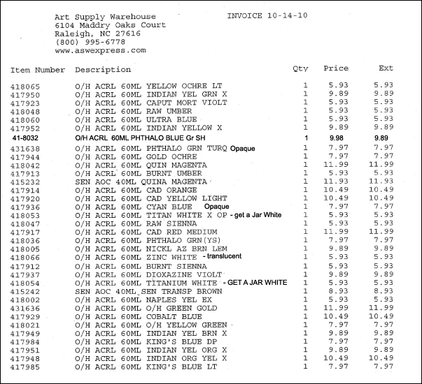
Here is a list of ACRYLIC RCW COLORS, Old Holland / Sennelier from one retail company.
RCW pigments

NEXT, Real Color Wheel Chart, table not image. Very Accurate
PREVIOUS, Get a wallet sized Real Color Wheel

Sitemap Index Image Link

All About Color Course  | Site Tree Index of Paintings, links  | children learning color  | painting waves  | human proportions and painting  | painting fresco  | Wikihow/How to Use the Real Color Wheel


Order this complete color course on DVD, $35.00.
Order only a 5"x5" Laminated Real Color Wheel $10.00.


Locations of visitors to this page