|
A+, Saunders Waterford 300#, Rough and Hot Pressed. A truly great paper A+, Twinrocker 300#, Rough, large deckle, light tub size, pre-wash needed, moderate rough texture. Cold Pressed. A+, Strathmore Gemini 300#, Rough and Cold Pressed. A+, Arches, 300# and 400#, Pre wash, won't stain on first wash, great texture, erases anything. A+, Fabriano Esport, Rough and Cold Pressed. A+, Fabriano Classico, 140# only, excellent, hard. A+, Fabriano Uno 300#, Soft Press, is between hot and cold pressed. A, Strathmore Excalibur 80#, 25% cotton, 75% fiberglass. You must erase pencil lines before painting, hard to brush erase. Fun to paint on.
B+, Indian Handmade, expect paper flaws.
B, Morilla, one stroke paper, no brush erasing, fiber moves too easily. B, Magnani Aqurello, too hard, colors float and dry with a line. B, Magnani Aqueforti, too soft, paper crumbles under erasing. B, Langaqural, soft, sucks up paint, edges can be softened. F, Westport, obvious pattern on both sides. |
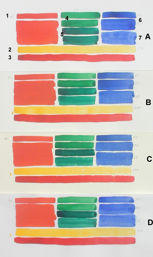
Does the W/C paper weight show colors differently?
A= Strathmore Aquarius II, 80#
B= Arches Aquarelle, 140#, Hot Pressed
C= Arches Hot Pressed, 300#
D= Xerox Alpha, 70#
1= Single stroke of Grumbacher Finest Vermilion Light
2= Single stroke of Bocour Cad. Yellow Med.
3= Single stroke of Grumbacher Red
4= Bocour Emerald Green
5= Grumbacher Thalo Green
6= W/N French Ult. Blue
7= Talens Ult. Blue
| This image is pretty accurate with no added contrast. The only one of the four papers that showed any difference in color intensity is the top paper, Strathmore Aquarius, 80#, 25% cotton - 75% fiberglass. On 10-9-10, #969, I did a 30x22 in three primary transparent colors with Arches Aquarelle, 140#, Hot Pressed, the chemical colors sunk so far into the paper I couldn't make a bright painting. I added thicker pigment particles to stay on the top of the paper. Bt. umber, ultramarine blue and a white that I made with titanium white and lime white. This worked but took a lot of time. I don't think I'll be using any more of this paper. I don't think color intensity had anything to do with the weight, rather, what it was made of. |
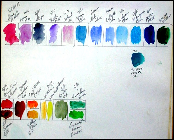
Water Color Pigments
This is what my palette looks like, the colors are combined in wells
to facilitate mixing by keeping colors clean.

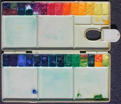
Medium size w/c palette, 5 1/4 x 12
Top Row
01a, Talens Ult. Blue Deep / 01b, Liquitex Bt. Sienna
02a, Grumbacher Finest Chromium Green Oxide / 02b, Rowney Venetian
Red
03a, Grumbacher Finest Thalo Purple / 03b, Grumbacher Finest Thalo
Green
04a, Grumbacher Finest Thalo Crimson / 04b, Grumbacher Finest Thalo
Green
05, Grumbacher Finest Thalo Violet
06, Grumbacher Finest Thalo Crimson
07, Grumbacher Finest Grumbacher Red
08, Grumbacher Finest Vermilion Light
09, Grumbacher Finest Cadmium Orange
10, Grumbacher Finest Cadmium Yellow Deep
11, W/N Cadmium Yellow
12, Bocour Cadmium Yellow Medium
13, W/N Windsor Yellow
14, Liquitex Hansa Yellow
Bottom Row
15, Grumbacher Finest Thalo Blue
16, Grumbacher Finest Thalo Purple
17, Liquitex Cobalt Blue
18, Talens Ultramarine Blue
19, W/N French Ultramarine Blue
20, Grumbacher Finest Thalo Green
22, Grumbacher Finest Emerald Green
23a, Bocour Emerald Green / 23b, Liquitex Permanent Green Light
24a, Bocour Olive Green / 24b, Holbein Permanent Green #1
25, Talens Hookers Green Deep
26a, Grumbacher Finest Cadmium Orange / 26b, Bocour Cadmium
Yellow Medium
27a, Liquitex Hansa Yellow / 27b, Grumbacher Finest Yellow Green
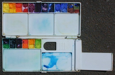
Small everyday palette, 3 1/2 x 8 1/4
I have a separate palette for night painting.
|
This is how I do an area with watercolors. Pattern outline the area to be colored in. Wet it in but don't touch the pencil outline because that would make the graphite a pigment.
When there is only a light sheen or no sheen at all start at the top left and lay the paint in with the heel of the brush loaded and enough mixed paint still on your palette, enough for another brushload. Leave the highlights dry.
When that's very dry, erase the pencil line around the pattern. While that pattern is drying you could wet in another pattern that can take a big wash. Maybe it's the second half of the panting, like the sky. Re-wetting a dried pattern will not move the paint so you have a choice, another wash or partial wash adding nuances to the first wash. This is where the big time work is done, your blends here are spectacular. To find the color of, let's say a table top's shadow color, you use the Real Color Wheel. If the table top is Bt. Sienna. Burnt Sienna is a dark orange. Orange is #RCW4 on this color wheel of 36 colors. Burnt Sienna is a dark orange translucent, Burnt Umber is very dark Orange. The opposite color of orange would be #RCW22, Cobalt Blue, opaque. The darkest Cobalt Blue looks like Ult. Blue but Ultramarine Blue is translucent. The Permanent Blue by W/N is a translucent ultramarine hue without the grain. Both Ult. Blue and Cobalt Blue will mix neutral with either a medium dark Orange translucent or very dark Orange translucent. Those are the combinations that mix the shadow colors of the table top. If your only using 3 colors, mix your yellow and magenta first in the puddle and add cyan by the pinch. |
NEXT Oil Palette Setup
PREVIOUS
Pigment Chip Chart to Real Color Wheel
Order this complete color course on CD, $35.00.
Order only a 5"X5" Laminated Real Color Wheel $10.00.